Body Prints 2
Posted: February 26, 2015 Filed under: Documentation, Subject, Third Year | Tags: art, body, colour, documentation, printing Leave a commentAs I have previously said, I wanted to do a bigger body print in colour.
I chose a position where different areas of my body could be printed. This was quite easy to think about when I wasn’t covered in paint and rolling around my floor. Once I got the paint on, which I found hard to keep the colours as they were without accidentally mixing the colours up and making sure they stayed wet and didn’t dry too much before I printed myself, getting into the position was difficult without printing an area when I wasn’t in position. This did happen and I didn’t get all areas printed that I wanted to but I was expecting something to disagree with my plan. 
I find the bottom of the print where my legs are, is very messy. Too many legs without knowing what they are or where they should be. It has made me realise how my stomach is hidden by my breasts and thighs in this position. I wanted my belly to more present in this – mostly because it’s solid blue, my most disliked area of my body.
I tried another position – actually two on one sheet. I don’t like this as much – I got paint all over it before I even printed myself so it’s even more messy than the one above.
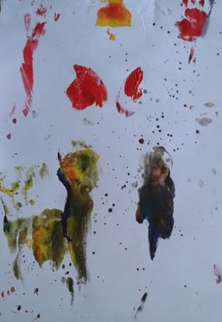
Overall I prefer the black and white body prints I did, but it was fun to experiment with colour and on a larger scale. Similarly, it was not fun scrubbing it off – covered my shower in dried paint.
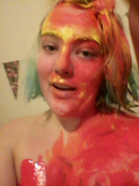
(Selfie with paint all over my face and hair. Managed to get some in my mouth too.)
Prints and Photo Collages
Posted: February 26, 2015 Filed under: Documentation, Subject, Third Year | Tags: art, body, books, collage, contemporary, documentation, drawing, experimentation, female, female figure, prints Leave a commentI feel that I have done so much experimentation and yet need to do more. Everyone keeps suggesting to do bigger photos but I don’t think I am ready for that, plus photography isn’t a strong medium for me.


These were all done with black ink, through an etching onto a photograph. Some of the prints came out more clearer than others which I expected. I do really like the photograph after it has been used, I would prefer it to be a little more cleaned and then maybe made into books or safely displayed.


The coloured ones are with reference to the areas of my body I like and dislike. The top image came out really well whereas the second one was more of an accidental splodge (moved it while it was on the paper.) Although it doesn’t show the body shape, I like how the colours have merged together. I would like to try to create an image where the colour merges together, like this one, but where the body is recognisable.


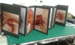
Some of these photo collages I really liked as they were and others I am thinking of stitching onto them. Figure 4 is probably one of my favourites, as my arms are extended in the same place in each image even though they are different poses. As I have previously written, I intended to create little books for my photos to go into. So far, I have made two for just photo collages, 2 for drawings (with pockets so the drawing can be taken out and rearranged with other pieces – they are the drawings that are based on the creases of my skin) and 2 that are made from drawings from tracing paper.


I am planning to make more so that all my photos and drawings can be displayed nicely. I don’t know whether I will display them within my final exhibition as it depends on what I produce as my final piece (still don’t have an idea yet) but I hope that they can be used in some way.
Elene Usdin
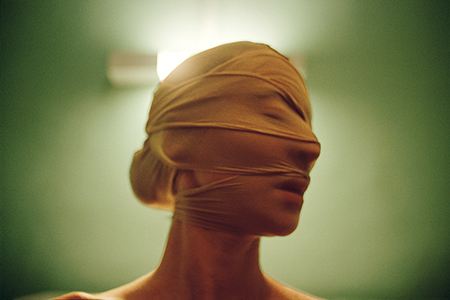
Posted: February 26, 2015 Filed under: Contextualisation, Subject, Third Year | Tags: anti-beauty, art, artist research, body, contemporary, contextualisation, female body Leave a commentOne of my friends discovered Usdin and sent her as a reference to me, as the photo shoot I did with the tights and string technique, is similar to some of her work.
Usdin is a french photographer and illustrator. Her eerily beautiful work has a rich foundation in her dreams and nightmares. She started out as a set designer and in 2004 discovered photography initially learning by taking self portraits. The work behind closed doors allowed her to play with lighting and different approaches to body language.
“Like a distorting mirror, the images are mine, but they have been somewhat transformed and sometimes magnified as a result of working with other people.”

London 19/1/15
Posted: February 26, 2015 Filed under: Contextualisation, Subject, Third Year | Tags: art, artist research, contemporary, contextualisation Leave a commentNational Portrait Gallery
I haven’t been to the National Portrait Gallery in such a long time. I’m not particularly interested by realistic paintings as the technology we have today can capture the same affect however I do appreciate ridiculous talent.
John Singer Sargent was an American artist from the Renaissance period. He was a deeply cultured man and the exhibition draws out the range of influences that helped shape his creative vision. Throughout his life Sargent painted portraits of artists, writers, actors and musicians, who were his friends. Such pictures were rarely commissioned and the artist was free to create more radical images than was possible in formal portraiture.The result is a selection of highly charged portraits that form a distinctive strand in Sargent’s work; intimate, peculiar and experimental.
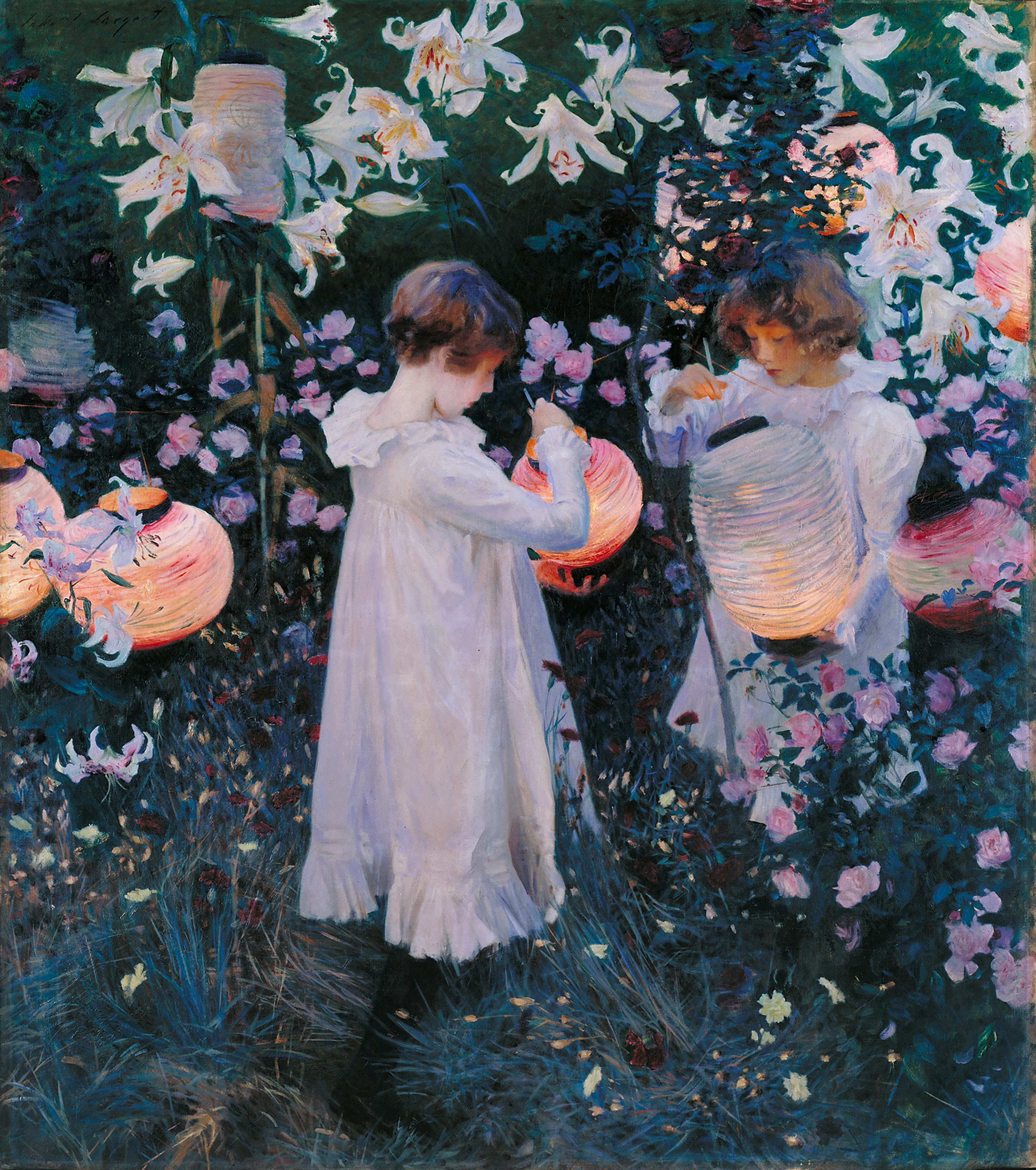
“Carnation, Lily, Lily, Rose,” 1885-6 Oil on canvas
In 1885, while Sargent was on a boating trip on the Thames, he saw what he described as a “paradisiac sight”: two little girls lighting paper lanterns at dusk in a garden planted with roses. This vision was the inspiration for this painting, painted during the late summer and autumn of 1885 and 1886 in Broadway,Worcestershire. French Impressionism, English Pre-Raphaelistism and Astheticism have influenced this painting, while the flower imagery references the Italian Renaissance and their poetic symbolism.
Probably one of his most well known pieces, Sargent explores the conditions of light at a particular time of day in this painting. I love the colours and how it reminds me of my childhood memories. I loved the idea of magic and fairies and used to hide fairy statues in my garden as a child. Similarly, it reminds me of a film based on two little girls who discovered that fairies exist,in the bottom of the garden. It is as if I am looking at an old memory.
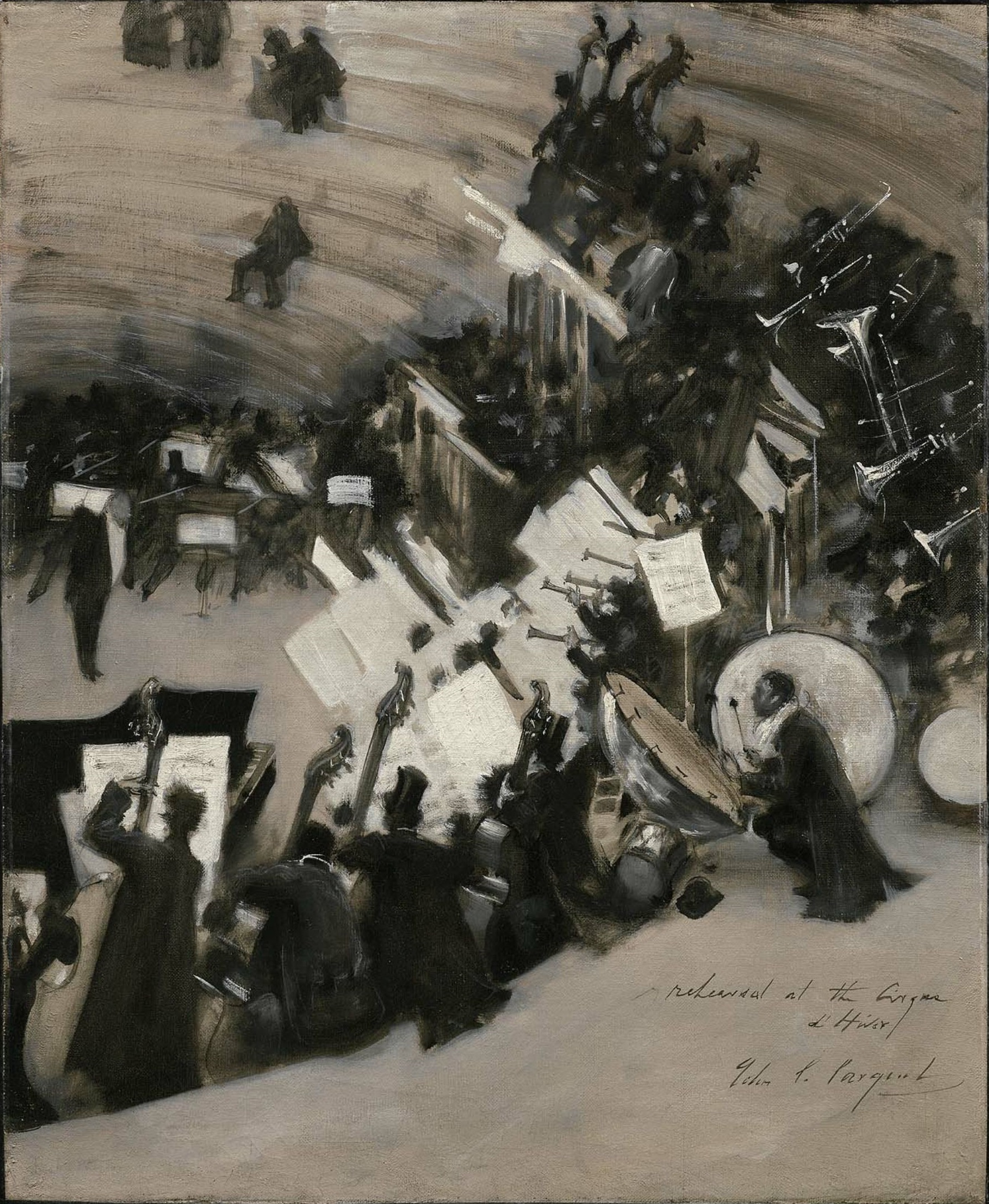
“Rehearsal of the Pasdeloup Orchestra at the Cirque D’Hiver” 1879-80 Oil on Canvas
This study of rehearsal life is one of a very small number of depictions that Sargent made of contemporary city life. The Cirque d’Hiver is a small amphitheatre in the 11th arrondissement of Paris. Pasdeloup’s classical concerts were popular in 1861. Pasdeloup’s programme was adventurous and his policy of cheap seating helped to create a new audience, promoting the composition of new French symphonic works and making Wagner’s music known in France.
I love this painting as it displays movement and captures the atmosphere of the orchestra. As I was looking at the painting, I felt as if I became the audience of the orchestra. You can never take your eyes off an orchestra, the talent that the musicians have and the music they produce. I was drawn to this painting as it was the only monochromatic painting in the room. It was also the only one of multiple people which I found engaging.

“Mary Anderson” 1913 Charcoal on paper
Mary Antoinette Anderson (1859-1940) was an American actress known for her performance as Juliet in Shakespeare’s play. Two years later she appeared on stage as Lady Macbeth before embarking on a lengthy American tour. She was admired for her beauty and her dramatic talent. In 1889 she married Antonio de Navarro, a fellow wealthy American and they moved to Broadway, Worcestershire; the village where Sargent had painted “Carnation, Lily, Lily, Rose.”
I particularly liked this drawing as it was drawn simply in one material. The charcoal does not affect the picture with dark, scruffy lines but gives the image a soft, more feminine feel to it. Anderson has been drawn incredibly and she has a familiarity to my Aunt which I love. I also like how Anderson’s hair has been drawn in the opposite direction to the background and items of clothing which gives the picture a still movement.
Grayson Perry‘s “Who Are You?” exhibition displays new works including a self portrait and a tapestry made during his Channel 4 series “Who Are You?”
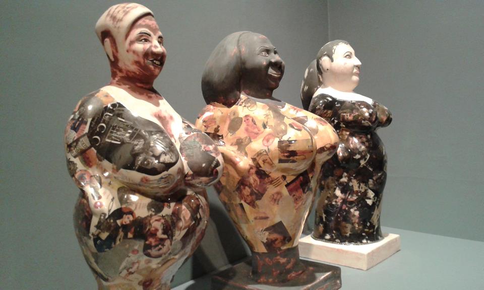
“Melanie, Georgina and Sarah” 2014 Glazed Ceramic
These three women, big and proud who want their size to be seen as a positive. Perry portrayed them as antique figures covered with images of female perfection and food. In history of sculpture, female forms were often seen as fertility goddesses to be prayed upon for children and plentiful harvests. These days, the female figure are more likely under the microscope for growing health problems.
This piece of work is very influential for me. I have a big figure but I am more towards wanting myself to see my size as a positive rather than other people. I would prefer other people to dislike my body and for me to love it, whereas at the moment I feel that others don’t take notice and I am very aware of my size. This feeling has become more noticeable with my work, as I am focusing on my body and how I perceive it with photographs and collage.
Alessandro Raho “Dame Judi Dench,” oil on canvas

“Dame Judi Dench”
Jason Brooks “Paul,” acrylic on canvas

“Paul” (Sir Paul Nurse)
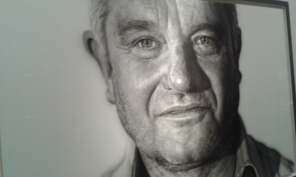
“Paul” (Sir Paul Nurse)
Hiroshi Sugimoto “Queen Elizabeth 2” Gelatin silver print laid on aluminium

“Queen Elizabeth 2”
I chose these three artists and their work in particular as I thought they were the most realistic and I preferred them the most (except Marc Quinn self portrait, which I couldn’t get a good enough photograph due to lighting.) I love Raho’s painting of Dame Judi Dench. Although painted with oil, the painting doesn’t seem heavy but soft and light, like she’s floating above the canvas. Brooks’s painting of Sir Paul Nurse is incredible. When I first saw it I thought it was a photograph but when you look closely, the edges of his face seem to blur and fade into the background. It is possibly one of the best contemporary paintings I have ever seen.
Tate Modern
I was recommended to go see Marlene Dumas by my friends and peers. Dumas’ intense, psychologically-charged works explore themes such as sexuality, love, death and shame, often making reference to art history, popular culture and current affairs. She never paints directly from life, instead choosing to use pre-existing images for her source material.
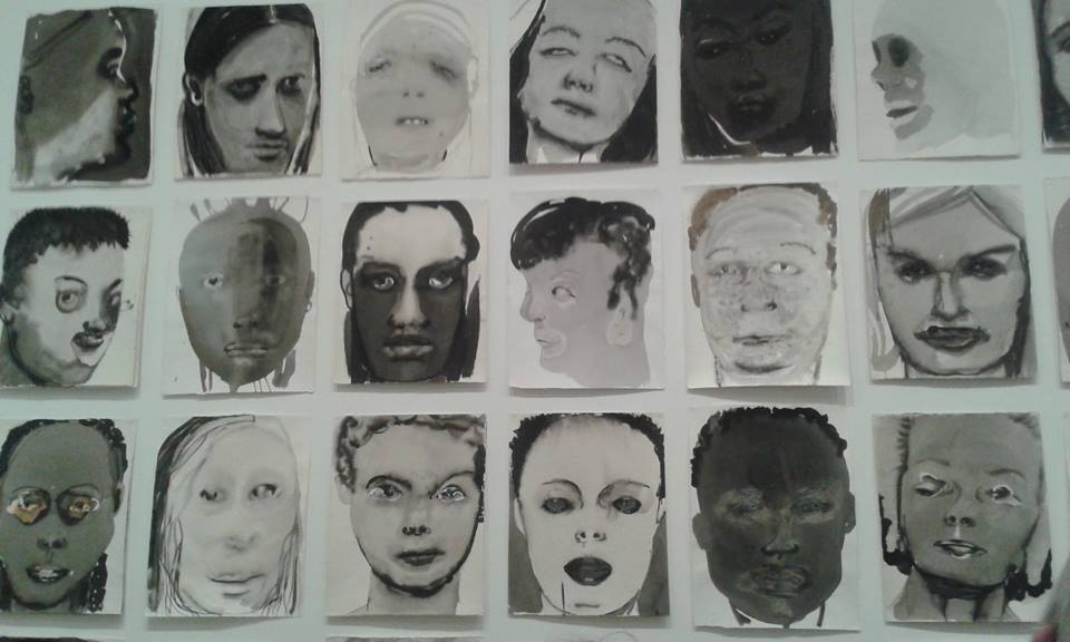
“Rejects” 1994-2014
“Rejects,” is a series of ink and graphite “portrait heads” pinned directly to the wall. It began with images Dumas had discarded from another piece of work. This reminded Dumas of the “reject-stores” in South Africa that sold clothes with imperfections. By bringing these “rejects” together, Dumas made the artistic process of selection and judgement visible, perhaps implying a parallel with the ways in which society accepts some and excludes others.
I love this piece and it is probably my favourite from the whole of her exhibition. I found the faces intriguing as they all represent something different. I enjoying using ink in my own work, how it disperses onto wet paper and I feel that Dumas might have used ink for the same reason – the “reject” is able to disperse from the paper and how it is seen.
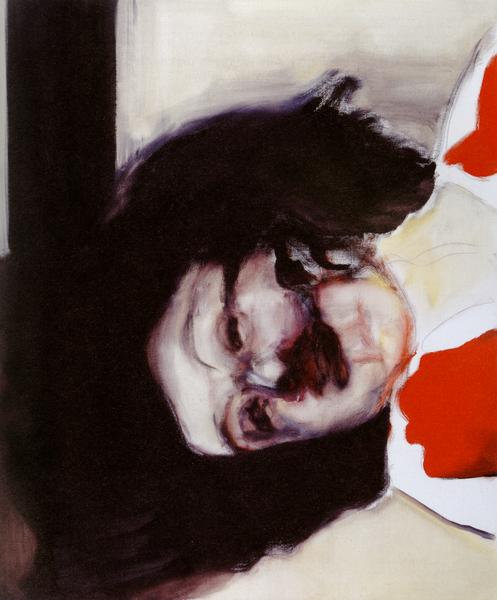
“Dead Girl” 2002
At the turn of the century, Dumas moved towards representations of war. She used images of dead terrorists, martyrs, suspects and look-alikes, as well as the escalation of conflicts in the Middle East. Rather than focus only on contemporary source images, she often returned to earlier material to express a mixture of personal anxiety and universal tragedy.
In “Dead Girl,” Dumas returned to a clipping from the 1970’s of a young woman who has attempted to hijack a plane and was killed. This painting is a reminder of political history of contemporary charged events and the representation of the female body during conflict and war.
Louise Bourgeois
Although Bourgeois is recognised for her ambitious sculptures, she produced a large body of works on paper throughout her lifetime. Drawing and printmaking were important aspects in her practice. The exhibition at Tate Modern shows how she reworked ideas from earlier in her career, using drawings and parables to create books of engravings or to explore auto biographical scenes.
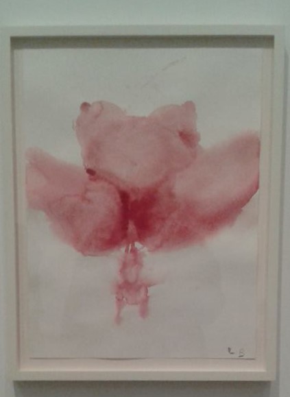
“The Birth” 2007
Gouache on paper, “The Birth,” is beautiful, graphic, raw and instinctive. Bourgeois often depicts the female form as an abstracted fertility form often encountered in ancient civilizations reminding us that even with our modern day technology, childbirth is just as primordial as it ever was.
This particular piece reminds me of Tracey Emin and the concept of “leaky bodies.” I love that the body shows the birth with a light colour. I feel that the gouache aids the idea that the body leaks out the baby, that the baby is not the main object in this piece.
I really liked “Look Up!” 2009 an etching on paper. I found that most of her drawings and prints seemed botanical, but in particular, “Look Up!” reminded me of a bean stalk – but not like ones from fairytales. Literally a stalk made from beans. I liked that each individual ‘bean’ was different, not in size or shape but in colour and definition.
Energy and Process
I only went to the energy and process exhibition and not the structure and clarity exhibition. This was down to time management – the bus was late arriving in London due to an accident. The exhibition displays artists interests in transformation and natural forces. The Italian artists of Arte Povera produced work that explored changing physical states instead of representing things in the world, while in Japan and the United States the Mono Ha and Post Minimalism movements looked for alternatives to a sleek technological aesthetic.
Nicholas Hlobo

“Balindile” 2012
Hlobo weaves, plaits and stitches together disparate materials to create intricate and seductively tactile sculptures and drawings. He titles his work in his native language Xhosa, an Nguni language spoken in South Africa. Attracted to the formal qualities of the grammar, the sounds of the words, and the linguistic flexibility of Xhosa, Hlobo’s use of the language, with all its poetic idioms, proverbs, and double entendres, is as much about defining himself as it is an effort to emphasise the challenges of openly talking about homosexuality in South Africa.
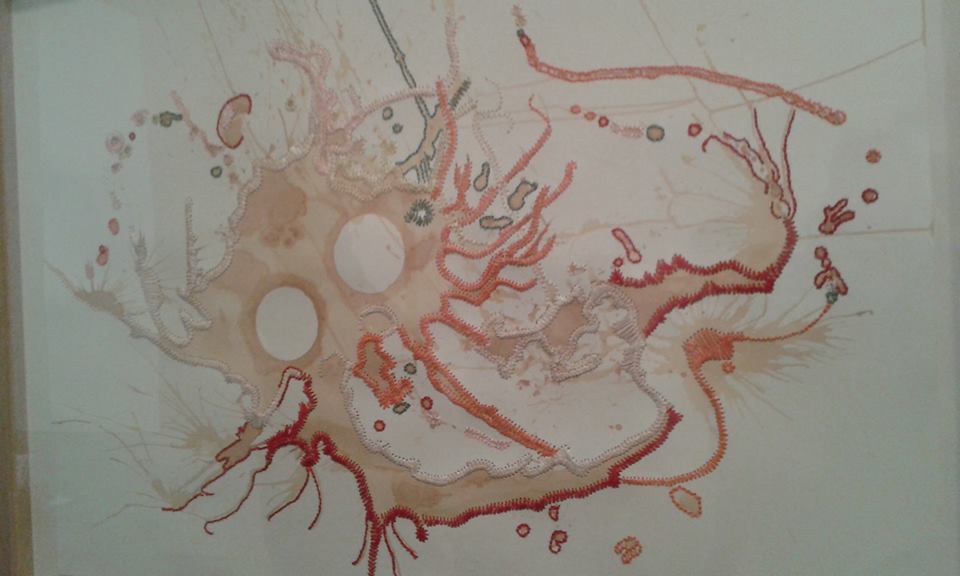
“Macaleni Lintozomlambo” 2010
“Macaleni Lintozomlambo,” tea and ribbon on paper. The tea stain forms the base for the drawing. The tentacles of stitch and ribbon are emphasised by orange and red stitches and they are defined by light coloured ribbon. Sexual connotations are present in this piece, the fleshy tones and slippery surface.The title refers to a tradition of an Xhosa belief, where boys throw rocks into the river before skinny dipping as a sign of respect to the river.
I particularly liked this piece due to the colour and sea animal tendency. I thought the piece felt as if something was drowning, the white circles representing dead eyes, the tentacles floating as water overpowers the animal. Although my concept of the piece was morbid and isn’t reflected in the representation of the Xhosa belief, I can see how water and flesh is combined.
Pino Pascali
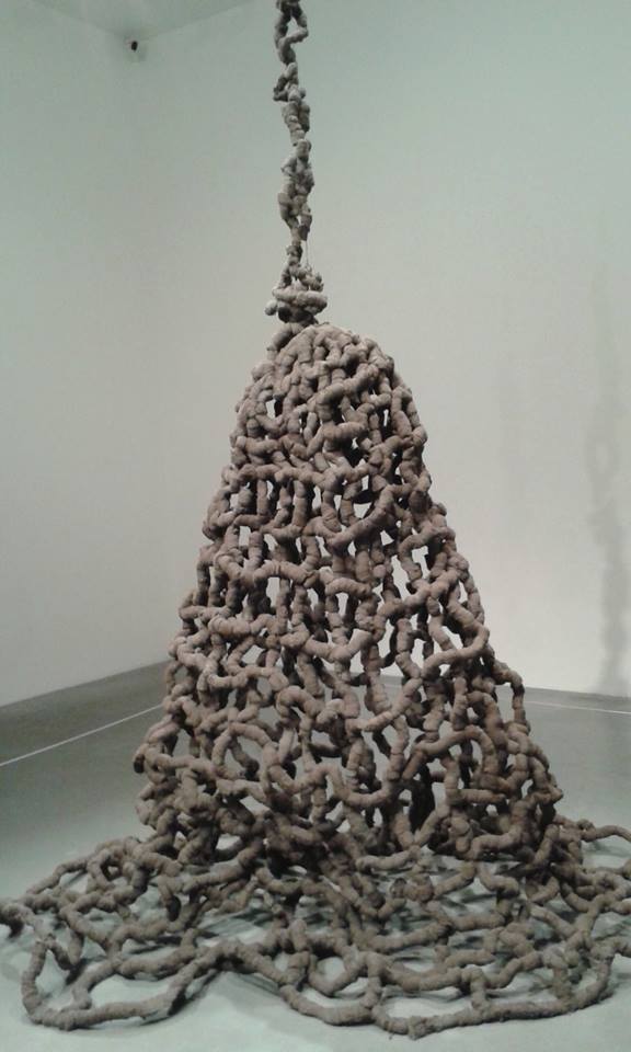
“Trap”
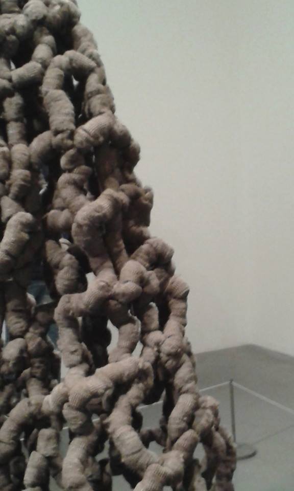
“Trap”
Made using steel wool,Pascali’s Trap evokes the rope traps used to hunt animals in adventure stories and Tarzan films.
Pino Pascali was one of the most important Italian artists of the 1960s and took part in the first Arte Povera shows but he was killed in a motorcycle crash in 1968. Sceptical of artists who adopted a consistent style, Pascali attempted to change the materials and themes of his work with every new show. Trap was from his penultimate group of sculptures, the Reconstructions of Nature series, shown at the Attico Gallery in Rome in 1968.
I particularly liked this piece due to the complexity of it. The intertwined structure of a maze, a simple idea into a difficult sculpture is fascinating. I like how the title represents how it is seen and perceived. Also I find that as the colour of the wool is a sludgy brown, it could easily be exhibited outside, as part of a landscape. A maze is a hidden object, where the route is only seen from birds eye view, whereas this is easily seen as a complex sculpture with no way out.
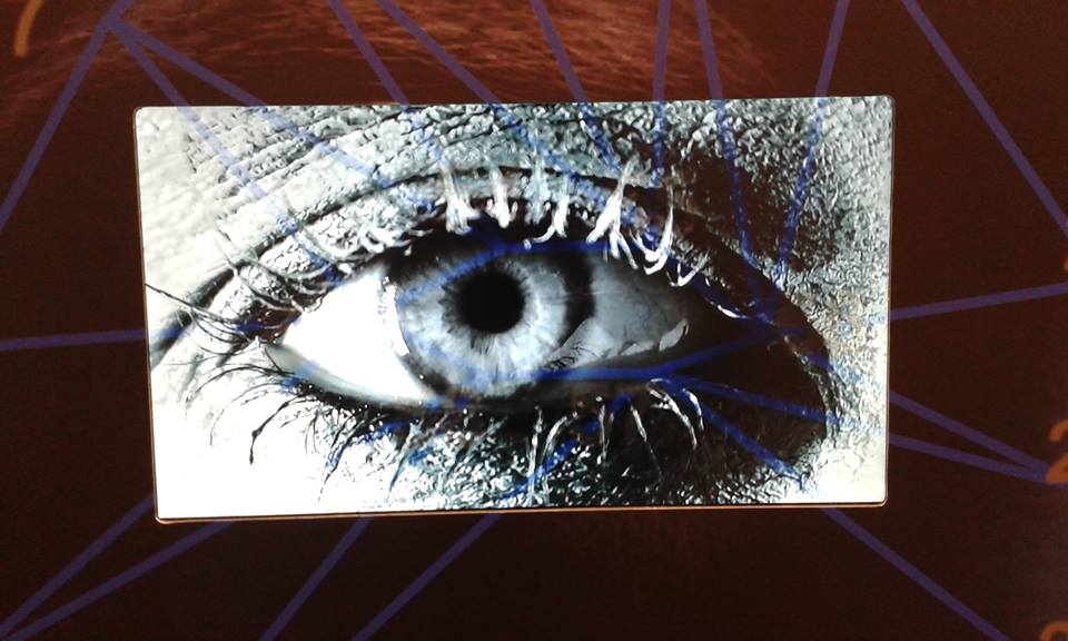
Lisson Gallery
This exhibition centres around his fascination with the evolution of identity via techniques of facial recognition technology.His interest in the face as the locus of communication and identity, through features, movements and expression, is central to these works. Tony Oursler‘s main installation reflects an ongoing body of multimedia works related to mimetic technology and its effect on contemporary psychology.

“Less-than-perfect” 2014

“less-than-perfect” (detail) 2014
I love the ghost tearing off the inner face in “Less-than-perfect.” I feel that it gives an eerie approach to a piece of work that I see as rather humorous. I find it humorous as Oursler has complimented his take on the devil with Kelly Osbourne – the daughter of Ozzy Osbourne – known for being lead vocalist to Black Sabbath and a TV personality. Growing up, I only really knew him for being the guy who bit the head off a bat – devil-ish type of man.

“PIX” 2014
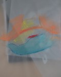
Experimentation with Colour and Stitch
Posted: February 20, 2015 Filed under: Documentation, Subject, Third Year | Tags: art, body, documentation, experimentation, female figure, photography, stitch, subject, watercolour Leave a commentIn an earlier post I mentioned how I don’t use colour and that if I did use colour it would be to represent areas of my body that I like and dislike. For example, red is a warm colour so I would use red in the areas of my body that I like. Colours inbetween the primary colours, like purple and green are difficult. I have been using greens as positive colours and purples as negatives. Through experimentation, I noticed that the reds and blues stayed in the same places whereas greens and purples have been changing. I don’t know whether this is due to me beginning to love areas of my body or that I got bored of painting the same areas the same colour. I think it may be the latter however, I began to realise that it may have been to how I was feeling that day. This is very personal and exactly why I use colour to represent my feelings towards myself.
I thought using ink would be a good idea to start as it would create soft works as the ink dispersed into the wetted paper. Using the representations of colour, I found these were abstract although some were still direct to the body. I particularly like the few that are not obvious images of the body.


I began with watercolours on tracing paper. I wanted to show the curves and folds of my body but as I mixed the powder myself, I got too excited with throwing it around my studio and got distracted with what I was supposed to be doing.
Using machine stitch on tracing paper is difficult, as the paper is so thin. I ripped a lot of the drawings with my machine so I tried hand stitching – also didn’t go too well. I know that it would have been difficult and needs patience – something I didn’t have after sewing on many photographs earlier that day.


Using the machine on photographs were much easier as the paper is thicker and doesn’t rip as easily, or at all. These are the photographs that were taken in the AV studio. I have selected about 20 that I feel are the best to be framed. They are all black and white which I think makes them softer and more professional.
I chose some that would only have paint on them, others just stitch and others both paint and stitch. Some that I initially wanted stitch and paint on them, I found that I preferred with just paint and left them as they were. I have loads of originals left which I plan to collage. These photographs will be displayed in homemade sketchbooks. I don’t know what sketchbooks they will be yet, whether it’s constantines or books with pockets etc. I still need to experiment with these on a larger scale.


Einhard Zang
Posted: February 20, 2015 Filed under: Contextualisation, Subject, Third Year | Tags: body, contextualisation, female body, printing, subject Leave a commentWhile researching artists who work with bodies within printing, I discovered Einhard Zang, a German artist who creates works of art using body prints. He is interested in mixed media, collage, body printing and lithography.
He tries to give the anthropometric symbolism visualised by Yves Klein another dimension. He believes that the model and portrayal are separated and belong together only through artistic communication. These relationships change in the body prints.
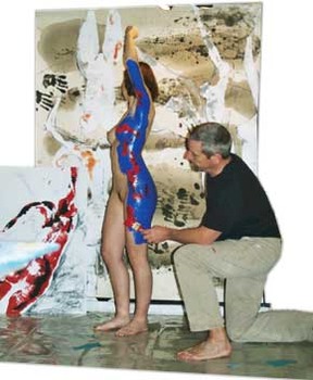
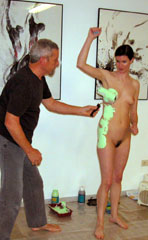
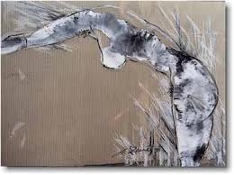
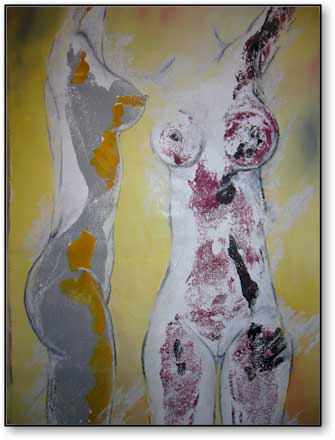
“The individuality and personality of the model play an important role in further processing of the original print. I like to place special emphasis on the experimental character of the work.”
I like that he creates pieces centred around a shape that is changeable. Although it is clear that his work is based upon the body, some pieces are not obviously figure like. I feel that if he didn’t form the body through drawing, the abstraction of the print would be clearer. This could then be used as a different model form.
Body Prints
Posted: February 20, 2015 Filed under: Documentation, Subject, Third Year | Tags: art, body, documentation, female, prints, subject Leave a commentI thought it would be fun to experiment through body printing. I started with my nipples but they just looked like blobs on the page. I thought that a print of my face would be interesting especially if I make a face while doing it. Painting my face and hair was fun, scrubbing it off was not.

face

face

breasts and torso

right hand side of torso and breast

breasts and torso
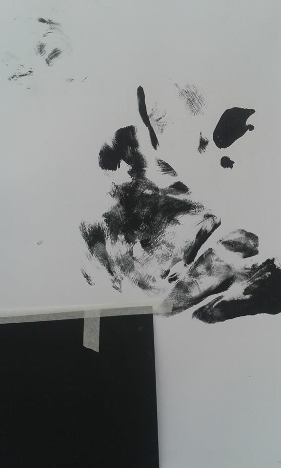
right hand side of body and face
I would like to do more of these on a larger scale, so that I can get my whole body in. I like the idea of butterfly effect and recently been playing around with acrylics and ink with this effect. I hope to experiment with colour within these prints.
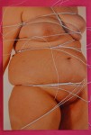
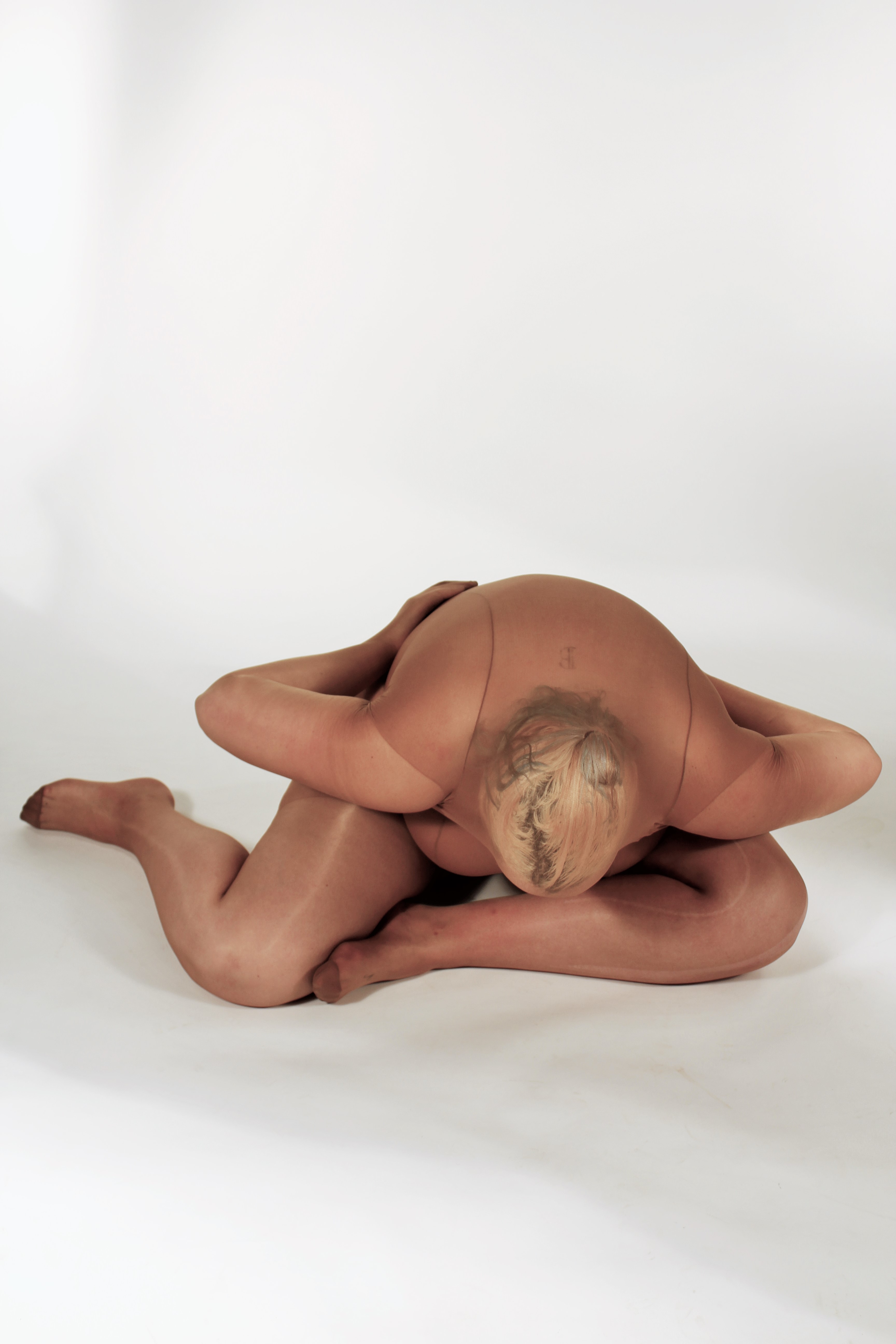
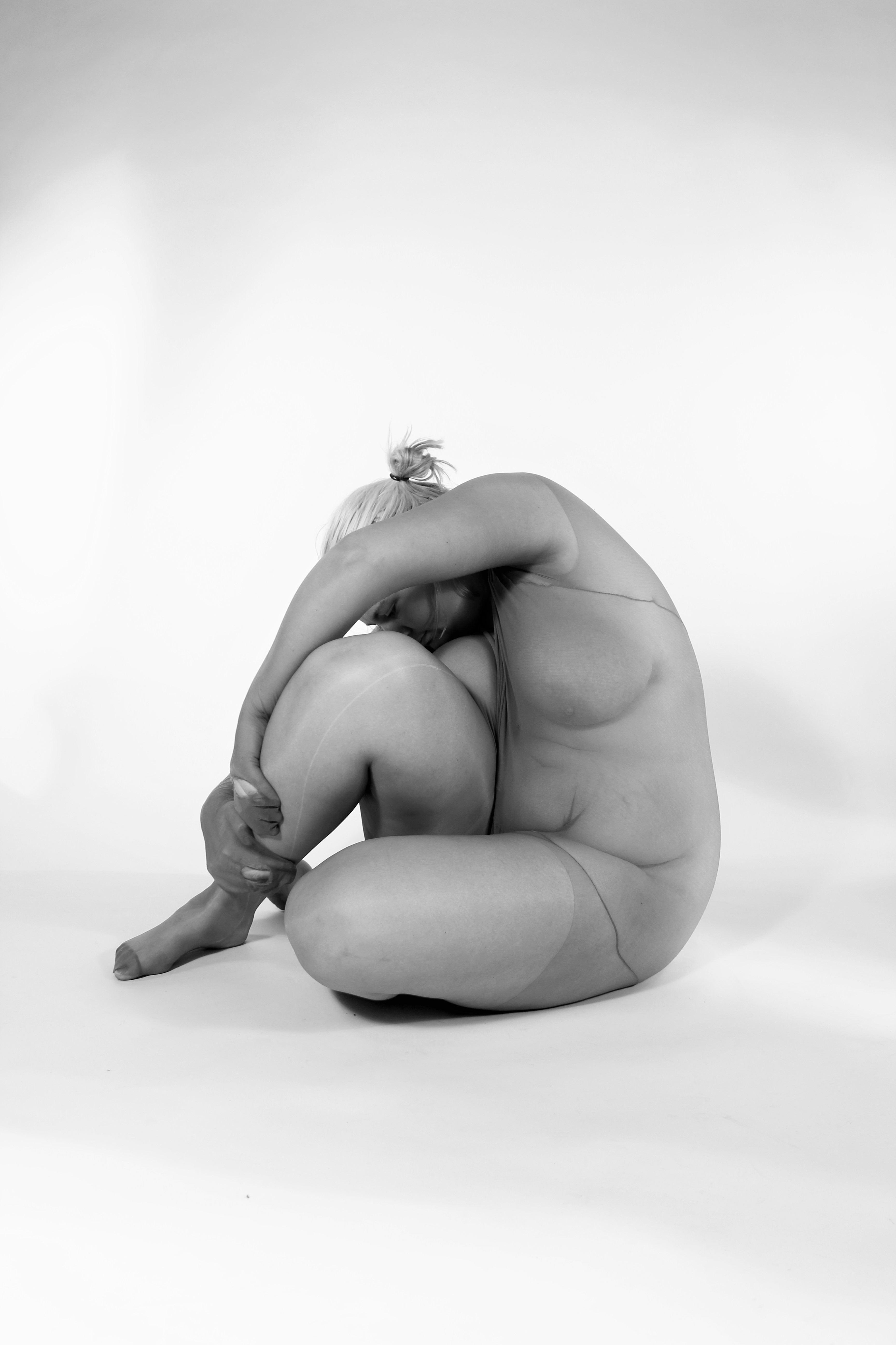
Photoshoot no. 2
Posted: February 12, 2015 Filed under: Documentation, Subject, Third Year | Tags: documentation, female body, photography, subject 3 CommentsA few weeks ago I booked out the AV studio for an afternoon and asked one of my friends who is interested in photography within her work to take photos of me. This wasn’t as awkward as the first time I did it, as I found that she just saw a body and not mine in particular. We did think that this was because of our experience with life models within Fine Art, whereas, the first photo shoot, my “photographer” is studying Textiles.
I had a really fun day doing this, as I experimented with tights, string and clear perspex (which wasn’t as good as I thought.) I have edited a few of the photos and they are currently being printed. The editing took a long time to do and I was experimenting with light and contrast. I knew what I wanted the photos to look like as I kept many of them as the original. I found that I liked the black and white edits the most but I plan to frame others, in different edits.
I had a wonderful tutorial Monday afternoon, where my tutor and I spoke about motivation and the feeling when everything can be done. I have recently thought about getting back into book arts I plan to make a few little books that keep the discarded images in. I plan to experiment with stitch onto the photographs, particularly over parts of my body I don’t particularly like or to accentuate these areas. I want to incorporate smaller drawings into these books, with or without the stitch.
(This is the most terrifying thing that I can do – putting my photos onto my blog.)


Hans Bellmer
Posted: February 12, 2015 Filed under: Contextualisation, Subject, Third Year | Tags: body, contextualisation, drawings, Hans Bellmer, subject 1 CommentI have previously researched Hans Bellmer for my work as he was a main influence in my second year project and throughout the second chapter of my dissertation.
I am particularly looking at his drawings as they are inspired by the human body and the base of his work. Although his drawings are based upon the body, they are abstract and recognisable forms, creating a new interesting form.

These forms create a disturbed alien feel towards the body. I find his drawings enticing as they aren’t images of the regular body. I like the abstraction in his work, as I do in mine, but I think I will be experimenting with all my drawings and drawing abilities whether or not I will keep them abstract or obviously human.
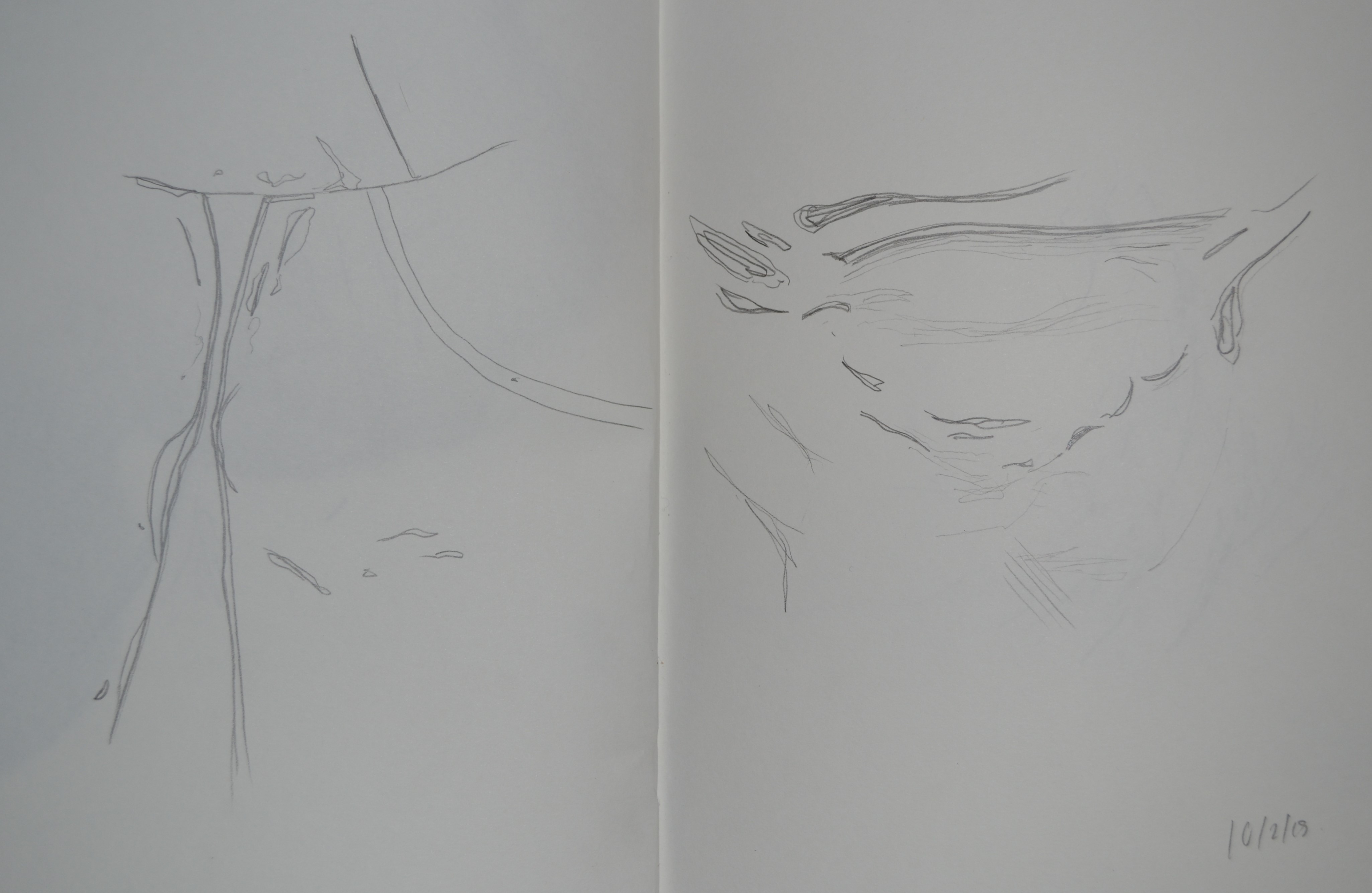
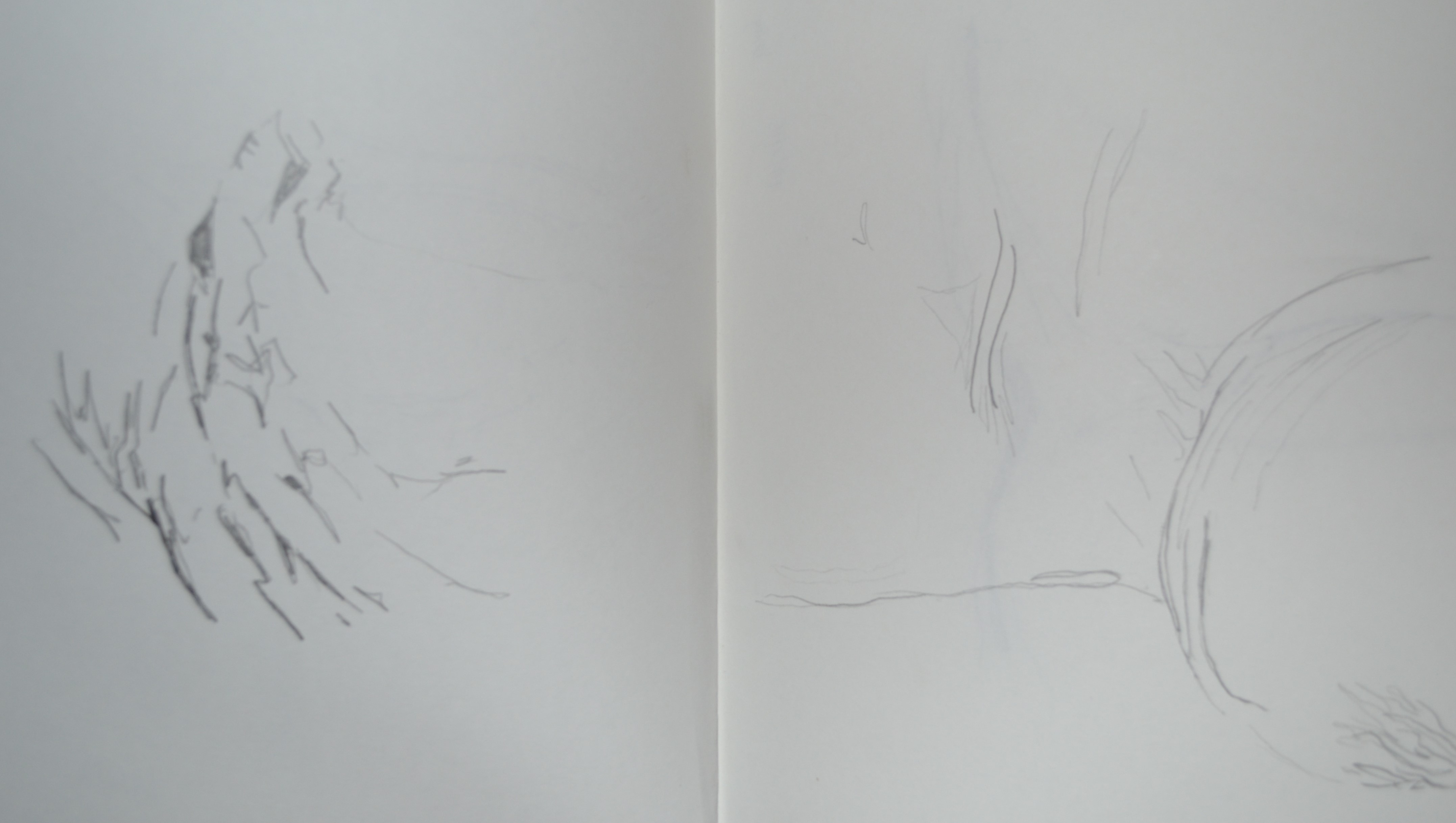
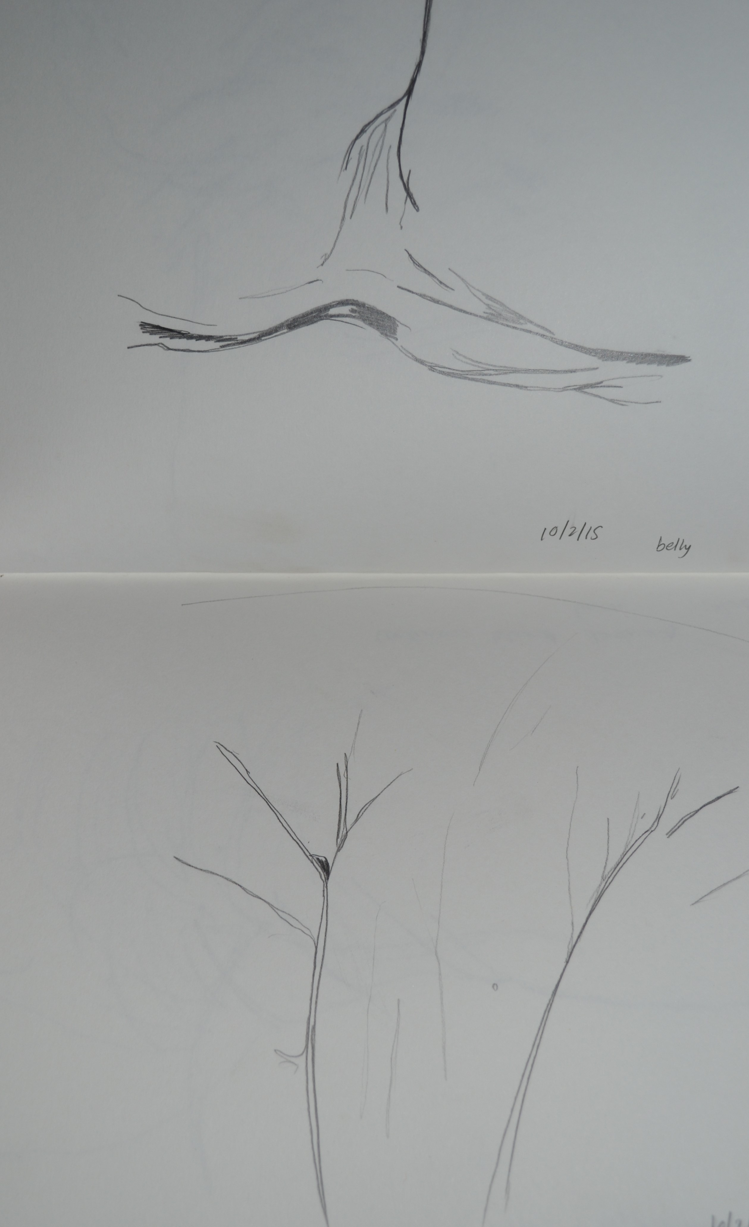
Drawings
Posted: February 12, 2015 Filed under: Documentation, Subject, Third Year | Tags: body, documentation, drawings, female body, subject, third year Leave a commentTo keep up my progression within this topic I have gotten back into drawing. I have found that the more I draw and experiment I become more involved and enjoy working with my body more.


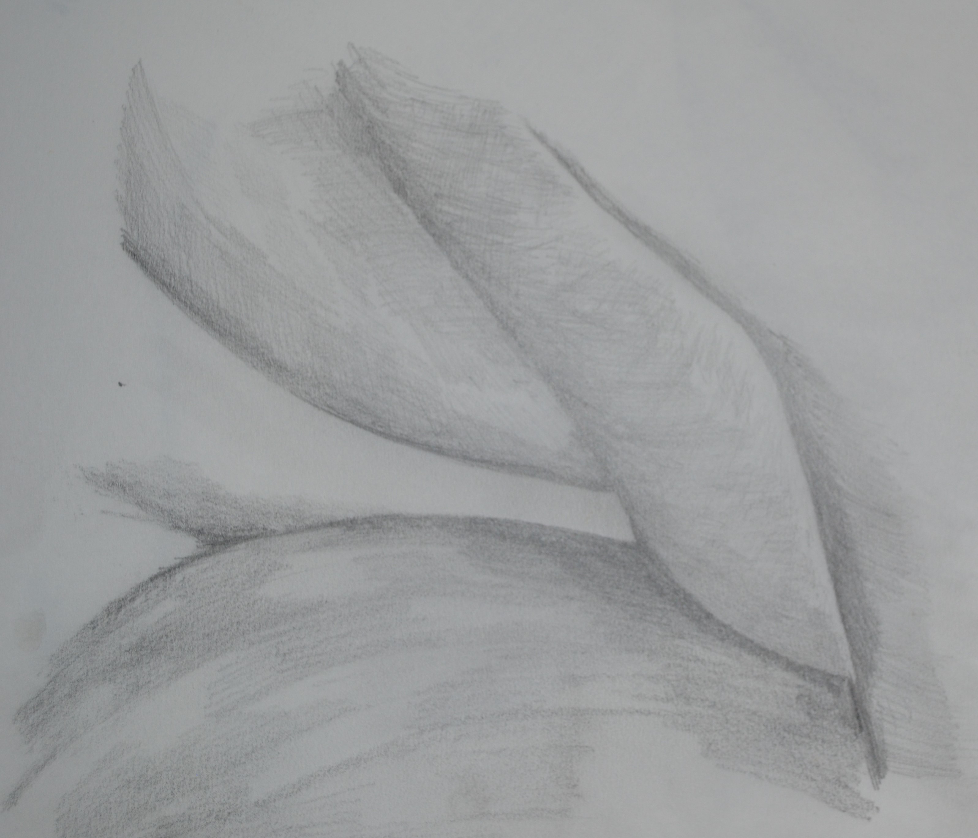
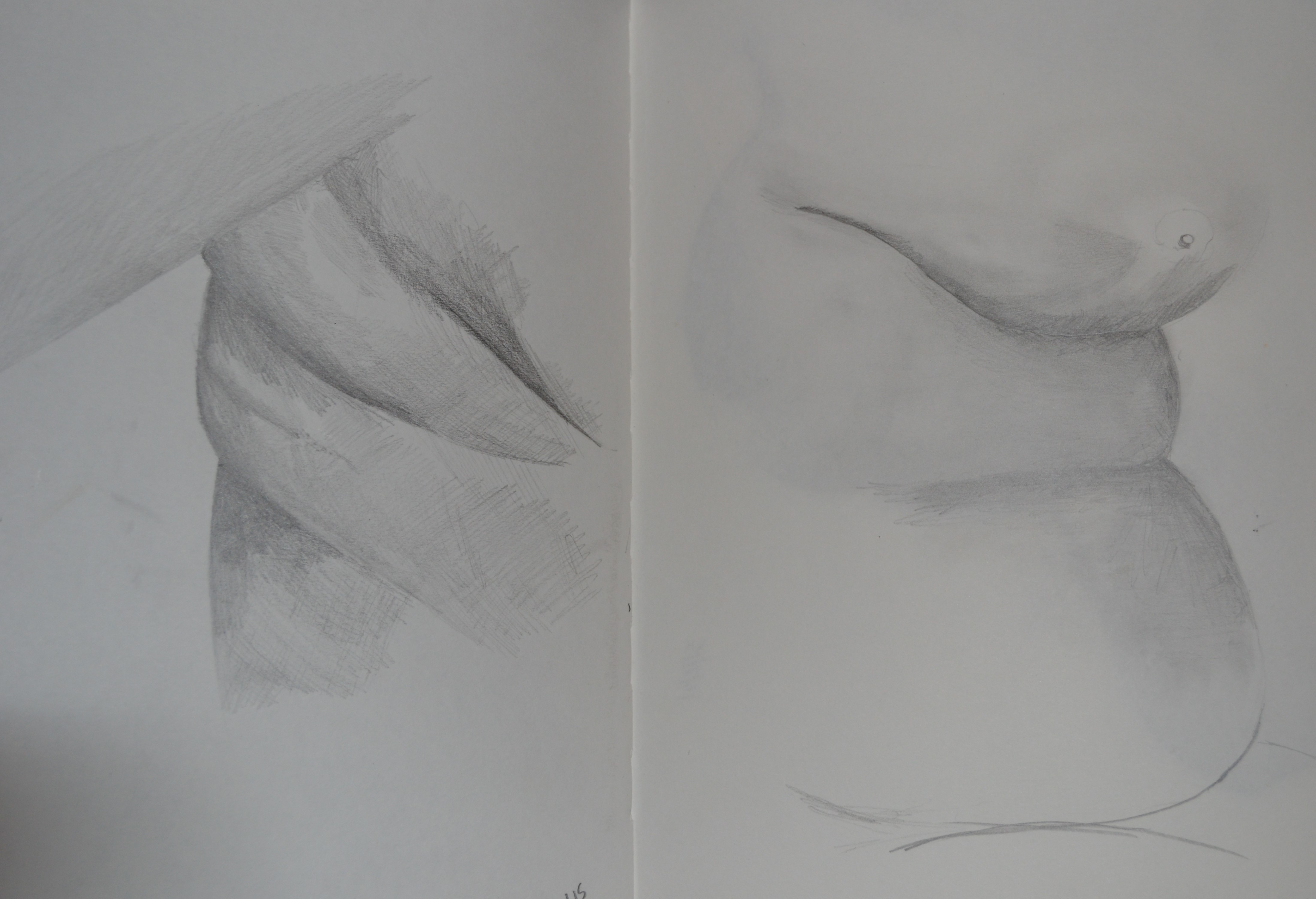
The next set of drawings are abstract but are based upon the creases in the skin. They are quite odd and don’t look like what they are drawn from which I find keeps happening within my work.