Experimentation with Colour and Stitch
Posted: February 20, 2015 Filed under: Documentation, Subject, Third Year | Tags: art, body, documentation, experimentation, female figure, photography, stitch, subject, watercolour Leave a commentIn an earlier post I mentioned how I don’t use colour and that if I did use colour it would be to represent areas of my body that I like and dislike. For example, red is a warm colour so I would use red in the areas of my body that I like. Colours inbetween the primary colours, like purple and green are difficult. I have been using greens as positive colours and purples as negatives. Through experimentation, I noticed that the reds and blues stayed in the same places whereas greens and purples have been changing. I don’t know whether this is due to me beginning to love areas of my body or that I got bored of painting the same areas the same colour. I think it may be the latter however, I began to realise that it may have been to how I was feeling that day. This is very personal and exactly why I use colour to represent my feelings towards myself.
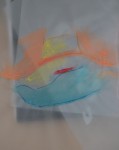
I thought using ink would be a good idea to start as it would create soft works as the ink dispersed into the wetted paper. Using the representations of colour, I found these were abstract although some were still direct to the body. I particularly like the few that are not obvious images of the body.


I began with watercolours on tracing paper. I wanted to show the curves and folds of my body but as I mixed the powder myself, I got too excited with throwing it around my studio and got distracted with what I was supposed to be doing.
Using machine stitch on tracing paper is difficult, as the paper is so thin. I ripped a lot of the drawings with my machine so I tried hand stitching – also didn’t go too well. I know that it would have been difficult and needs patience – something I didn’t have after sewing on many photographs earlier that day.


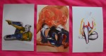
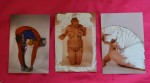
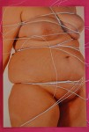
Using the machine on photographs were much easier as the paper is thicker and doesn’t rip as easily, or at all. These are the photographs that were taken in the AV studio. I have selected about 20 that I feel are the best to be framed. They are all black and white which I think makes them softer and more professional.
I chose some that would only have paint on them, others just stitch and others both paint and stitch. Some that I initially wanted stitch and paint on them, I found that I preferred with just paint and left them as they were. I have loads of originals left which I plan to collage. These photographs will be displayed in homemade sketchbooks. I don’t know what sketchbooks they will be yet, whether it’s constantines or books with pockets etc. I still need to experiment with these on a larger scale.


Number Fifty Six
Posted: May 19, 2014 Filed under: Documentation | Tags: drawings, fine liner, landscapes, penarth, watercolour Leave a comment
I really like this one, I spent about 20 mins doing it which I never do! I quite like the effect the rain gave the image.

Shadows of the seaweed from the beach overlapping each other

Watercolour painted with a pebble and my finger, rubbed in with wet sand.


I visited Penarth for a drawing day. I’m not a fan of drawing landscapes and I always think that the drawings I do aren’t great. I would like to do a colour drawing of the main pen landscape using tracing paper over the original.
Number Fifty Five
Posted: May 18, 2014 Filed under: Documentation | Tags: constantine, diss, drawings, female body, fine liner, homemade sketchbook, watercolour Leave a commentSurprisingly looking forward to start writing my dissertation after receiving my feedback for my tutorial – I passed (yay!)
As well as writing my dissertation (mostly over the summer) I am going to research as much as I can about the human body/female form within theory and practical work. I made a constantine sketchbook and filled it up with sketches of the female form.


I am currently trying to finish my ‘limb’ sculptures before I go home so I feel as if I have actually done a final piece for my Field project.
