Plan B (and C)
Posted: April 8, 2015 Filed under: Documentation, Subject, Third Year | Tags: body, contemporary, documentation, female body, subject Leave a commentPlan B
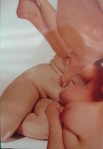
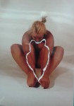
I still want to focus on the areas of my body that I dislike the most, this being my thighs and stomach. Using alginate, cast parts of my body that I have focused on the most. I wouldn’t use mod rock for this because as they will be smaller sculptures and I would prefer to have detail, plus as my initial sculpture is large, the mod rock is better for expenses and malleability.
For these sculptures, I would have each individual sculpture on a plinth, complementing one of the final photos that will be displayed on the wall. If this ends up being part of the exhibition, I would expect either three or four final pieces.
The only thing that I am not sure on is that I feel it might look too individual and abstract which is not what I want. I want it to look like a body and for viewers to see my body as a whole, not as individual parts.
Plan C
My weakest plan because it is literally just displaying drawings. I would however, enlarge the drawings and display these as a set. I planned to some of these over the holidays but I haven’t started them yet and even if plan A doesn’t work, I would rather fall back on B than C. I also think that my 3D work is much stronger than my 2D, especially as I don’t see myself as a strong drawer.
Manchester
Posted: April 2, 2015 Filed under: Contextualisation, Third Year | Tags: artist research, contemporary, contextualisation, manchester art gallery, whitworth Leave a commentI went home at the beginning of last week for a few days (yay!) and I knew I wanted to visit the Whitworth Gallery since it has been renovated. I couldn’t go all the way into town without popping into Manchester Art Gallery. Most of the artwork in there are always there and unfortunately, the contemporary rooms were opening the day after I came back to Cardiff.
The Whitworth
Cornelia Parker (until May 31st 2015)
Parker’s work transforms ordinary objects into the compelling and the extraordinary. Featuring career defining works i.e “Cold Dark Matter (An Exploded View)” 1991 and “The Distance (A Kiss with String Attached)” 2003. This exhibition also shows many new works that continue her preoccupation with dematerialising matter; bullets, blood and bronze are transformed into linear explorations. Unique to the Whitworth is “War Room,” a vast and immersive installation made from punched out paper negatives taken from the Poppy factory in Richmond, its moiré of empty spaces echoing the 45 million remembrance poppies made each year.

-

- “Poison and Antidote Drawing” 2012
“Poison and Antidote Drawing” 2012, rattlesnake venom and black ink, anti-venom and white ink. Over the years, Parker has made a series of poison and antidote drawings. When on a residency in Texas she asked the nearby rattlesnake farm if they could milk some snakes for her (disarming one of her greatest fears.) They procured enough bright yellow venom to kill at least ten people. She approached a local doctor to prescribe an antidote, a task, which was more difficult than acquiring the venom. Combining the poison with a quantity of black ink and the anti-venom with white ink, she produced works that literally have the ability to kill you and save you at the same time.
“Black Path (Bunhill Fields)” 2013 patinated black bronze. This piece is a cast of the spaces between the paving stones of the non-conformist cemetery of Bunhill Fields, London. The graveyard’s most famous incumbent is William Blake. Parker had often played ‘don’t step on the lines,’ or Hopscotch with her daughter, while on the route to school. These games rekindled an obsession with pavement cracks that had lain dormant since her own childhood. By pouring liquid cold-cure rubber into some of the gaps and letting it set, she was able to lift up this part the geography of the city that had been mapped out in stone many years before. The captured rubber cracks were upturned, then cast in bronze. Placed on steel pins, they appear to hover just above the floor, creating an obstacle, a kind of petrified line drawing.


“Cold Dark Matter: An Exploded View” 1991 blown up garden shed and contents, wire, light bulb. With thanks to the British Army.
“Living in London in the 80’s and 90’s, meant living with the constant threat of IRA bombs. Somehow the idea and imminence of the ‘explosion’ in society seemed such an iconic thing. You were being bombarded with its imagery. from the violence of the comic strip, through action films, in documentaries about Super Novas and the Big Bang, and least of all on the news in never ending reports of war. On my MA I had made a series of wooden explosions, attempting to give extreme volatility a fixed state of being. Now I wanted to create a real explosion, not a representation.”
The shed was blown up at the Army School of Ammunition in Banbury, with Semtex, a plastic explosive popular with terrorists. Parker mentions how she still remembers the pungent smell of the substance as she helped model it. She was sat in a bunker a long way off when she pressed the plunger that blew the shed skywards. The soldiers helped her comb the field afterwards picking up the pieces which, when laid out in the gallery, made it look like a morgue.
The first part of the title “Cold Dark Matter” is a scientific term describing invisible matter in the universe that scientists knew existed but yet couldn’t measure. The second part “An Exploded View” is a technical term to describe the laying out and labelling of parts of a machine in a diagrammatic way to show how it works, usually taking the form of illustrations in a car or washing machine manual. So the two parts of the title together sounds like a forensic examination of an emotional state or a murder. An attempt to measure something you can’t measure, or to formalise an explosion.
“War Room” 2015 poppy negatives, perforated paper left over from the manufacture of British Legion Poppies with thanks to the Poppy Factory, Richmond and The British Legion. An immersive installation made from punched out paper negatives taken from the Poppy Factory. The rows of empty spaces (of over 320,000 picked flowers) echo the endless symmetry of war graves, a left over remnant of the 45 million plus remembrance poppies made each year. The two layers of perforated paper hang a few millimetres apart creating a double negative. Moving around the empty spaces creates a moiré effect, which is physically and perhaps emotionally disconcerting.
I found “War Room” gave the illusion that the room was moving so when my eyes scanned the room, it began to hurt. I think that it would have been more peaceful and gentle for my eyes, if I had lain down and looked up as then I wouldn’t have been moving.
Cai Guo-Qiang (until June 21st 2015)
The artist Cai Guo-Qiang was born in China and now lives in New York. He is best known for his remarkable projects using gunpowder, including firework displays for the opening and closing ceremonies of the 2008 Beijing Olympics. His installation “Unmanned Nature” 2008, includes a 45 metre long. 4 metre high gunpowder drawing, is the first artwork to be shown in the Whitworth’s new landscape gallery, as well as the first time being shown outside of Japan.


Guo-Qiang lays out large sheets of Japanese hemp paper on the floor and then carefully places fuses and gunpowder across them, sometimes sprinkling the grainy powder by hand, as if sowing seeds into a field, sometimes working with brushes to manoeuvre the substance and create delicate sweeps of fine residue. Once the composition of the drawing is completed, sheets of cardboard are laid across it and the fuse is lit.
This was one of my favourite pieces from all the exhibitions in the gallery. I love how the piece is reflected in the pond and when there is a slight ripple in the water, it gives the feel of the gunpowder going off.
New Acquisitions (until August 16th 2015)
This exhibition marks the remarkable gift by The Karpidas Foundation of 90 contemporary works of art to the Whitworth and is presented in memory of Constantine Karpidas. Highlighting the work of established British and American artists and also those at the beginnings of their careers, it includes pieces by Anna Barriball, Richard Forster, Luke Fowler and Laure Prouvost. Photography features strongly with works by Josh Brand, Liz Deschenes and Wolfgang Tillmans, while paintings by Richard Aldrich, Michael Craig-Martin and Dexter Dalwood overlook the park.
Portraits (until November 22nd 2015)
This is a show about the lives about the relationships between the artists, collectors and curators who made the Whitworth. Collections are created by people: the people who acquire and present collections to a gallery; artists who make the works; curators and others who select and assemble works for public viewing; and, not least, the people who feature in the works themselves. This exhibition is animated by some of these people, from Francis Bacon’s portrait of his friend Lucian Freud to Sir Stanley Spencer’s drawing of Margaret Pilkington, honorary director of the Whitworth for over 20 years.
Johnnie Shand Kydd (until February 21st 2016)
Shand Kydd became known for capturing the incipient community of YBAs (Young British Artists) during the 1990s. He created hundreds of now iconic black and white images of his artist friends and has continued to track the progress of figures such as Sarah Lucas, Tracey Emin, Gilbert and George and Damien Hirst. This selection of works from Shand Kydd’s extensive and varied portfolio focuses on his yearly trips to the Greek island of Hydra at the invitation of the art collector and Whitworth patron, Pauline Karpidas. With an informal, convivial and occasionally poignant eye, Shand Kydd captures the annual summer confluence of invited members of the international art world.
Watercolours (until May 31st 2015)
The Whitworth is home to an internationally renowned collection of British watercolours. The greatest benefactor of this collection was John Edward Taylor, who presented and bequeathed 266 watercolours and drawings of the highest quality to the gallery between 1892 and 1912. John Edward Taylor was the owner of the Manchester Guardian (now The Guardian), and his gifts to the Whitworth epitomize how money from industrial and commercial ventures was transformed into cultural wealth, a vital force in both the history of the Whitworth and the city of Manchester it calls home. This wonderful exhibition shows highlights from Taylor’s collection, including works by three of the most gifted and celebrated exponents of watercolour: 22 works by J. M. W. Turner, seven by William Blake and four by John Robert Cozens.
The 1960’s (until January 10th 2016)
The 1960’s was a transformational decade for the Whitworth. A far reaching scheme to modernise the gallery resulted in a new open plan exhibition that responded to the design ideologies of the era, while the gallery itself began to actively acquire modern art and design. This exhibition presents work collected during that vibrant and politically inflammable period: painting, prints and sculpture from artists such as Peter Blake, Allen Jones, Bridget Riley, Richard Hamilton and Elisabeth Frink.
Textiles (until March 6th 2016)
The reopening exhibition in the textile gallery celebrates, through an exploration of green and its associations, the rebirth of the Whitworth as a beautiful, extended gallery space, its new relationship with the Whitworth Park and the green spaces outdoors. Many cultures associate the colour green with nature and nature’s attributes, including growth, fertility and rebirth. In recent years, green has also become the symbolic colour of the environmental movement. Drawing predominantly on the gallery’s own textiles collection, which ranges in date from the 3rd century AD to the present day, historic textiles from around the world are set alongside newly commissioned work from contemporary designers that responds to environmental issues – which underlines the fact that the new Whitworth is now one of the most environmentally-friendly galleries in the UK. Artists and designers represented include William Morris, C. F. A. Voysey, Lucienne Day, Keith Vaughan, Michele Walker and Susie MacMurray.
Sarah Lucas (until July 19th 2015)
The Whitworth’s renowned wallpaper collection is full of papers that are funny, challenging and striking. The sculpture court is reopened with a wallpaper installation that promises to be all of these things. Sarah Lucas’s “Tits in Space,” 2000 in which multiple pairs of cigarette-encrusted orbs float against a pitch black background. Alternating between risqué and cosmic. “Tits in Space,” embodies the wide-ranging and often contradictory mood of Lucas’s work and forms a backdrop to a selection of sculptures by the artist, who will represent Britain in this year’s Venice Biennale.


I wish that this exhibition had been up while I was writing my dissertation as Lucas was one of the artists that I wrote about while exploring anti-beauty. I love how the sculptures become alien and human within the same form, whilst depicting relationships. The poses the sculptures display are quite pornographic and yet they harbour a mass of implications about gender stereotypes, war, death, and the very way we consume the world around us.
Thomas Schütte (until July 19th 2015)
“Low Tide Wandering,“ a series of etchings by the leading German artist Thomas Schütte, promises to be one of the most remarkable print installations of recent years. After drawing in sketchbooks as a form of visual diary for several years, in 2001 Schütte changed his practice and began to use etching. For “Low Tide Wandering,” Schütte produced 139 images that range from views of the sea, through quirky portraits of friends and acquaintances, to flower studies – all everyday subjects. World events of 2001, including the dramatic attack on the Twin Towers in New York, also intrude into these personal preoccupations.


I found that the prints that I enjoyed the most were either monochromatic (not surprising) or humorous. Although Schütte’s prints are simplistic, they depict important events and his view on the world. A particular favourite of mine was the “Shit Happens,” as it’s humorous and exceptionally correct.
(Only popped “Genesis” in as it was also featured in my dissertation.)
-

- Sir Jacob Epstein “Genesis” 1930
Manchester Art Gallery
Unfortunately the contemporary galleries weren’t ready for the public when I went to Manchester Art Gallery but I had a stroll around the rest of the gallery. The classical paintings always stay the same but one gallery features someone new.
Emily Allchurch
Allchurch uses photography to recreate old master paintings and prints, constructing new and contemporary narratives. Using Utagawa Hiroshige‘s (1797-1858) wood block prints – that flourished in Japan between the 17th and 19th Century, she captures contemporary life and culture reflecting passages of time and change to landscape.


Allchurch created a piece specifically for Manchester Art Gallery, recreating “Albert Square,” 1910 by French Impressionist Adolphe Valette.


Jenny Saville
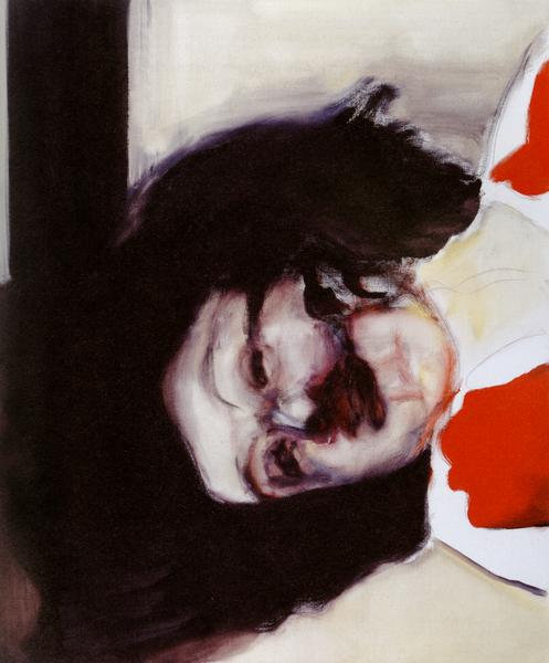
Posted: March 30, 2015 Filed under: Contextualisation, Subject, Third Year | Tags: anti-beauty, artist research, beauty, body, contemporary, contextualisation Leave a commentI should have written about Saville earlier in my work as she is an obvious artist to research, as her work focuses on flesh and oversized figures.
“Flesh is the most beautiful thing to paint.” And yet the bodies she paints are rarely conventionally beautiful. Saville paints with extreme states of grotesque – the figures are deformed, obese, brutalized/mutilated. Her fascination with flesh, the extremities of anatomy and the grotesque combined with a masterly and yet natural instinct for the handling of paint.
The dense, textured canvases provide evidence of a physicality that is unique and real which offers a refreshing counterpoint to the airbrushed, glossed and perfected images that impose a certain vision of beauty and femininity.
-

- “Strategy (South face/Front face/North face)” 1993-94
-

- “Prop,” 1993


-

- “Shift” 1996-97
-

- “Branded,” 1992
While I was experimenting with the manipulation of my figure, I played around with squishing my body against a transparent material, similar to Saville’s paintings. The acrylic wasn’t sturdy enough to squish my body as much as I could to give a similar effect Saville displayed in her paintings.
I’ve always liked Saville’s work and loved that she paints bigger women. Although the bodies are depicted as unconventional beauty, I find that the bravery Saville exposes while finding inspiration from larger women, beautiful as she defies the norms of conventional beauty.
Prints and Photo Collages
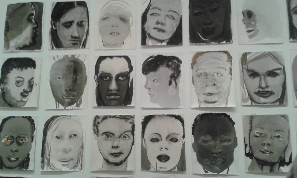
Posted: February 26, 2015 Filed under: Documentation, Subject, Third Year | Tags: art, body, books, collage, contemporary, documentation, drawing, experimentation, female, female figure, prints Leave a commentI feel that I have done so much experimentation and yet need to do more. Everyone keeps suggesting to do bigger photos but I don’t think I am ready for that, plus photography isn’t a strong medium for me.


These were all done with black ink, through an etching onto a photograph. Some of the prints came out more clearer than others which I expected. I do really like the photograph after it has been used, I would prefer it to be a little more cleaned and then maybe made into books or safely displayed.


The coloured ones are with reference to the areas of my body I like and dislike. The top image came out really well whereas the second one was more of an accidental splodge (moved it while it was on the paper.) Although it doesn’t show the body shape, I like how the colours have merged together. I would like to try to create an image where the colour merges together, like this one, but where the body is recognisable.


Some of these photo collages I really liked as they were and others I am thinking of stitching onto them. Figure 4 is probably one of my favourites, as my arms are extended in the same place in each image even though they are different poses. As I have previously written, I intended to create little books for my photos to go into. So far, I have made two for just photo collages, 2 for drawings (with pockets so the drawing can be taken out and rearranged with other pieces – they are the drawings that are based on the creases of my skin) and 2 that are made from drawings from tracing paper.


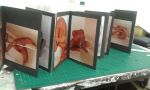


I am planning to make more so that all my photos and drawings can be displayed nicely. I don’t know whether I will display them within my final exhibition as it depends on what I produce as my final piece (still don’t have an idea yet) but I hope that they can be used in some way.
Elene Usdin
Posted: February 26, 2015 Filed under: Contextualisation, Subject, Third Year | Tags: anti-beauty, art, artist research, body, contemporary, contextualisation, female body Leave a commentOne of my friends discovered Usdin and sent her as a reference to me, as the photo shoot I did with the tights and string technique, is similar to some of her work.
Usdin is a french photographer and illustrator. Her eerily beautiful work has a rich foundation in her dreams and nightmares. She started out as a set designer and in 2004 discovered photography initially learning by taking self portraits. The work behind closed doors allowed her to play with lighting and different approaches to body language.
“Like a distorting mirror, the images are mine, but they have been somewhat transformed and sometimes magnified as a result of working with other people.”

London 19/1/15
Posted: February 26, 2015 Filed under: Contextualisation, Subject, Third Year | Tags: art, artist research, contemporary, contextualisation Leave a commentNational Portrait Gallery
I haven’t been to the National Portrait Gallery in such a long time. I’m not particularly interested by realistic paintings as the technology we have today can capture the same affect however I do appreciate ridiculous talent.
John Singer Sargent was an American artist from the Renaissance period. He was a deeply cultured man and the exhibition draws out the range of influences that helped shape his creative vision. Throughout his life Sargent painted portraits of artists, writers, actors and musicians, who were his friends. Such pictures were rarely commissioned and the artist was free to create more radical images than was possible in formal portraiture.The result is a selection of highly charged portraits that form a distinctive strand in Sargent’s work; intimate, peculiar and experimental.
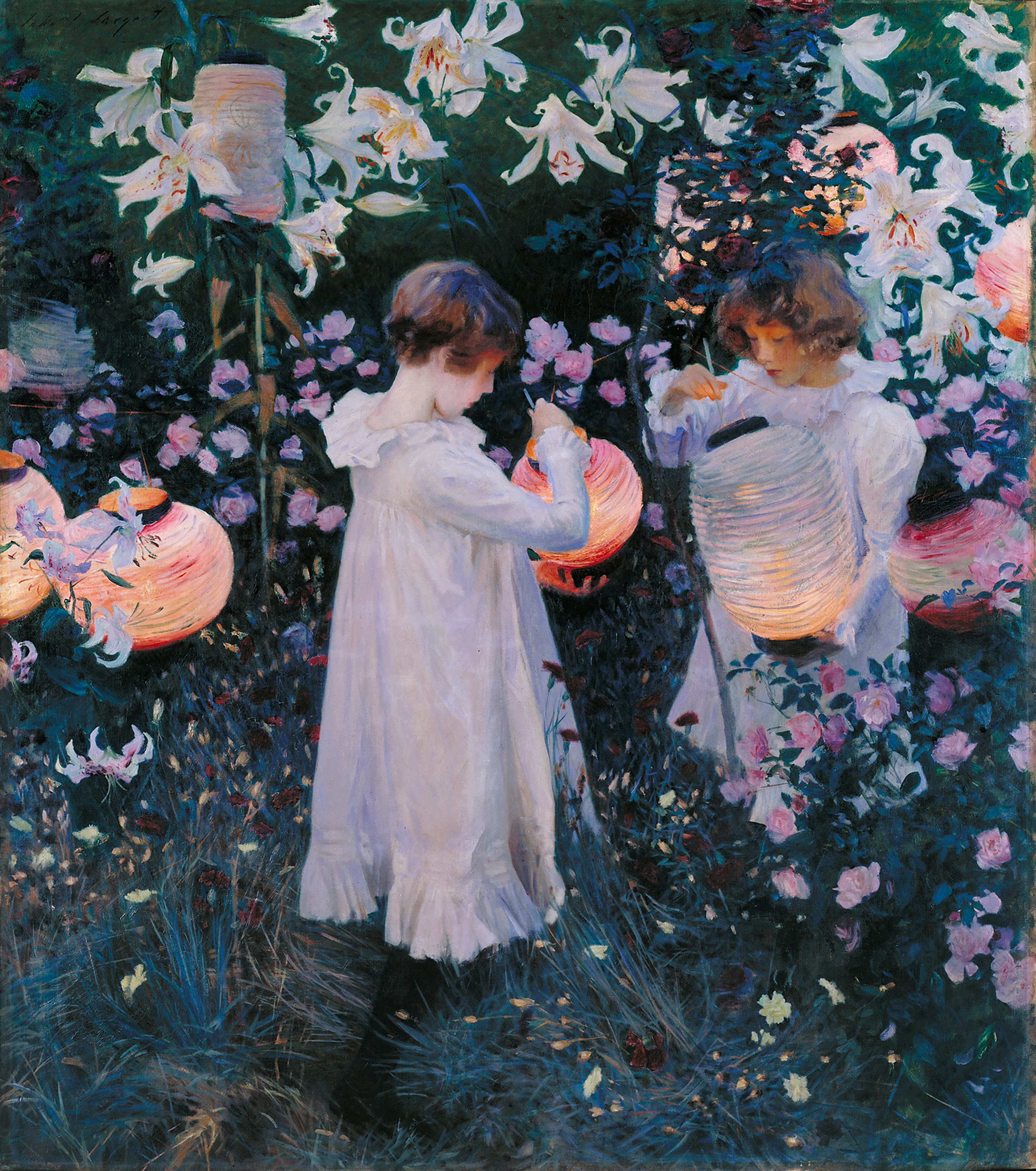
“Carnation, Lily, Lily, Rose,” 1885-6 Oil on canvas
In 1885, while Sargent was on a boating trip on the Thames, he saw what he described as a “paradisiac sight”: two little girls lighting paper lanterns at dusk in a garden planted with roses. This vision was the inspiration for this painting, painted during the late summer and autumn of 1885 and 1886 in Broadway,Worcestershire. French Impressionism, English Pre-Raphaelistism and Astheticism have influenced this painting, while the flower imagery references the Italian Renaissance and their poetic symbolism.
Probably one of his most well known pieces, Sargent explores the conditions of light at a particular time of day in this painting. I love the colours and how it reminds me of my childhood memories. I loved the idea of magic and fairies and used to hide fairy statues in my garden as a child. Similarly, it reminds me of a film based on two little girls who discovered that fairies exist,in the bottom of the garden. It is as if I am looking at an old memory.
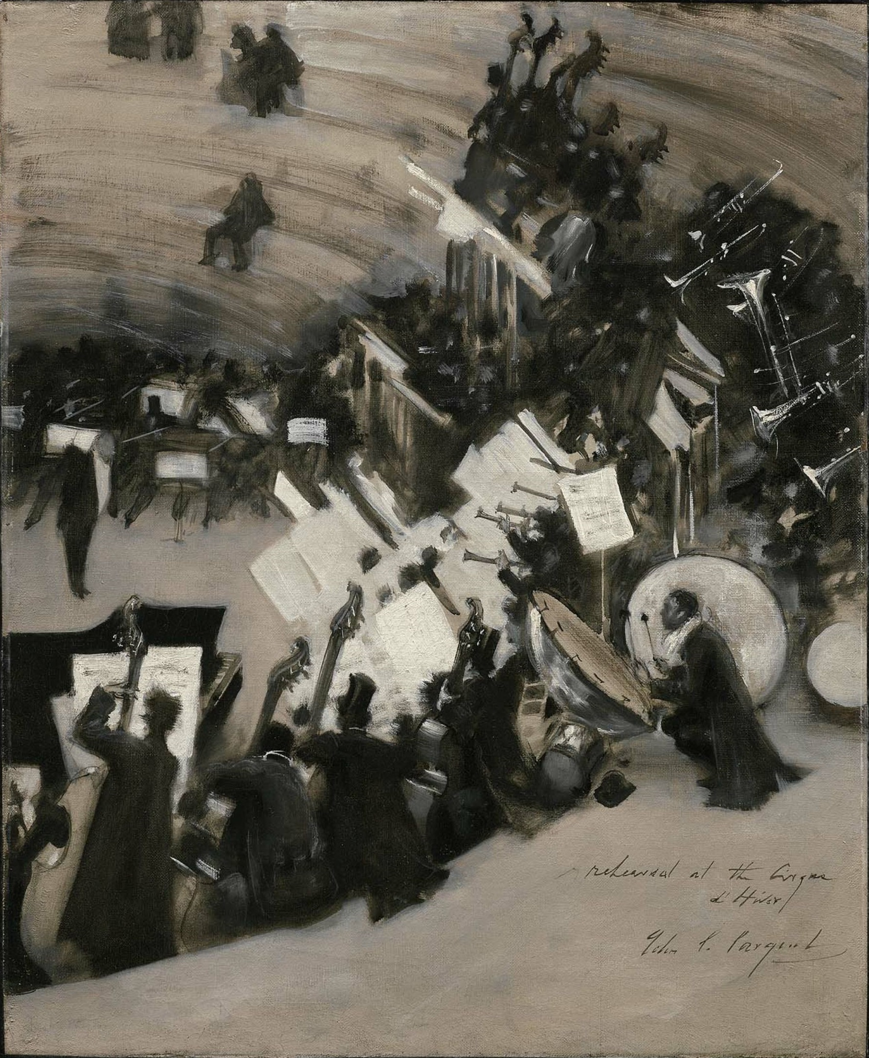
“Rehearsal of the Pasdeloup Orchestra at the Cirque D’Hiver” 1879-80 Oil on Canvas
This study of rehearsal life is one of a very small number of depictions that Sargent made of contemporary city life. The Cirque d’Hiver is a small amphitheatre in the 11th arrondissement of Paris. Pasdeloup’s classical concerts were popular in 1861. Pasdeloup’s programme was adventurous and his policy of cheap seating helped to create a new audience, promoting the composition of new French symphonic works and making Wagner’s music known in France.
I love this painting as it displays movement and captures the atmosphere of the orchestra. As I was looking at the painting, I felt as if I became the audience of the orchestra. You can never take your eyes off an orchestra, the talent that the musicians have and the music they produce. I was drawn to this painting as it was the only monochromatic painting in the room. It was also the only one of multiple people which I found engaging.

“Mary Anderson” 1913 Charcoal on paper
Mary Antoinette Anderson (1859-1940) was an American actress known for her performance as Juliet in Shakespeare’s play. Two years later she appeared on stage as Lady Macbeth before embarking on a lengthy American tour. She was admired for her beauty and her dramatic talent. In 1889 she married Antonio de Navarro, a fellow wealthy American and they moved to Broadway, Worcestershire; the village where Sargent had painted “Carnation, Lily, Lily, Rose.”
I particularly liked this drawing as it was drawn simply in one material. The charcoal does not affect the picture with dark, scruffy lines but gives the image a soft, more feminine feel to it. Anderson has been drawn incredibly and she has a familiarity to my Aunt which I love. I also like how Anderson’s hair has been drawn in the opposite direction to the background and items of clothing which gives the picture a still movement.
Grayson Perry‘s “Who Are You?” exhibition displays new works including a self portrait and a tapestry made during his Channel 4 series “Who Are You?”
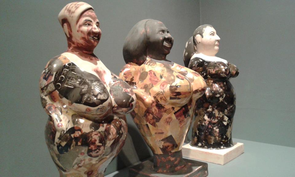
“Melanie, Georgina and Sarah” 2014 Glazed Ceramic
These three women, big and proud who want their size to be seen as a positive. Perry portrayed them as antique figures covered with images of female perfection and food. In history of sculpture, female forms were often seen as fertility goddesses to be prayed upon for children and plentiful harvests. These days, the female figure are more likely under the microscope for growing health problems.
This piece of work is very influential for me. I have a big figure but I am more towards wanting myself to see my size as a positive rather than other people. I would prefer other people to dislike my body and for me to love it, whereas at the moment I feel that others don’t take notice and I am very aware of my size. This feeling has become more noticeable with my work, as I am focusing on my body and how I perceive it with photographs and collage.
Alessandro Raho “Dame Judi Dench,” oil on canvas

“Dame Judi Dench”
Jason Brooks “Paul,” acrylic on canvas

“Paul” (Sir Paul Nurse)
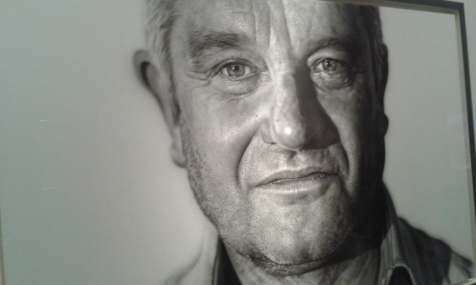
“Paul” (Sir Paul Nurse)
Hiroshi Sugimoto “Queen Elizabeth 2” Gelatin silver print laid on aluminium

“Queen Elizabeth 2”
I chose these three artists and their work in particular as I thought they were the most realistic and I preferred them the most (except Marc Quinn self portrait, which I couldn’t get a good enough photograph due to lighting.) I love Raho’s painting of Dame Judi Dench. Although painted with oil, the painting doesn’t seem heavy but soft and light, like she’s floating above the canvas. Brooks’s painting of Sir Paul Nurse is incredible. When I first saw it I thought it was a photograph but when you look closely, the edges of his face seem to blur and fade into the background. It is possibly one of the best contemporary paintings I have ever seen.
Tate Modern
I was recommended to go see Marlene Dumas by my friends and peers. Dumas’ intense, psychologically-charged works explore themes such as sexuality, love, death and shame, often making reference to art history, popular culture and current affairs. She never paints directly from life, instead choosing to use pre-existing images for her source material.
“Rejects” 1994-2014
“Rejects,” is a series of ink and graphite “portrait heads” pinned directly to the wall. It began with images Dumas had discarded from another piece of work. This reminded Dumas of the “reject-stores” in South Africa that sold clothes with imperfections. By bringing these “rejects” together, Dumas made the artistic process of selection and judgement visible, perhaps implying a parallel with the ways in which society accepts some and excludes others.
I love this piece and it is probably my favourite from the whole of her exhibition. I found the faces intriguing as they all represent something different. I enjoying using ink in my own work, how it disperses onto wet paper and I feel that Dumas might have used ink for the same reason – the “reject” is able to disperse from the paper and how it is seen.
“Dead Girl” 2002
At the turn of the century, Dumas moved towards representations of war. She used images of dead terrorists, martyrs, suspects and look-alikes, as well as the escalation of conflicts in the Middle East. Rather than focus only on contemporary source images, she often returned to earlier material to express a mixture of personal anxiety and universal tragedy.
In “Dead Girl,” Dumas returned to a clipping from the 1970’s of a young woman who has attempted to hijack a plane and was killed. This painting is a reminder of political history of contemporary charged events and the representation of the female body during conflict and war.
Louise Bourgeois
Although Bourgeois is recognised for her ambitious sculptures, she produced a large body of works on paper throughout her lifetime. Drawing and printmaking were important aspects in her practice. The exhibition at Tate Modern shows how she reworked ideas from earlier in her career, using drawings and parables to create books of engravings or to explore auto biographical scenes.
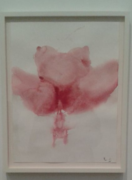
“The Birth” 2007
Gouache on paper, “The Birth,” is beautiful, graphic, raw and instinctive. Bourgeois often depicts the female form as an abstracted fertility form often encountered in ancient civilizations reminding us that even with our modern day technology, childbirth is just as primordial as it ever was.
This particular piece reminds me of Tracey Emin and the concept of “leaky bodies.” I love that the body shows the birth with a light colour. I feel that the gouache aids the idea that the body leaks out the baby, that the baby is not the main object in this piece.
I really liked “Look Up!” 2009 an etching on paper. I found that most of her drawings and prints seemed botanical, but in particular, “Look Up!” reminded me of a bean stalk – but not like ones from fairytales. Literally a stalk made from beans. I liked that each individual ‘bean’ was different, not in size or shape but in colour and definition.
Energy and Process
I only went to the energy and process exhibition and not the structure and clarity exhibition. This was down to time management – the bus was late arriving in London due to an accident. The exhibition displays artists interests in transformation and natural forces. The Italian artists of Arte Povera produced work that explored changing physical states instead of representing things in the world, while in Japan and the United States the Mono Ha and Post Minimalism movements looked for alternatives to a sleek technological aesthetic.
Nicholas Hlobo

“Balindile” 2012
Hlobo weaves, plaits and stitches together disparate materials to create intricate and seductively tactile sculptures and drawings. He titles his work in his native language Xhosa, an Nguni language spoken in South Africa. Attracted to the formal qualities of the grammar, the sounds of the words, and the linguistic flexibility of Xhosa, Hlobo’s use of the language, with all its poetic idioms, proverbs, and double entendres, is as much about defining himself as it is an effort to emphasise the challenges of openly talking about homosexuality in South Africa.
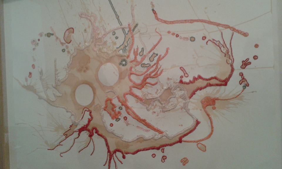
“Macaleni Lintozomlambo” 2010
“Macaleni Lintozomlambo,” tea and ribbon on paper. The tea stain forms the base for the drawing. The tentacles of stitch and ribbon are emphasised by orange and red stitches and they are defined by light coloured ribbon. Sexual connotations are present in this piece, the fleshy tones and slippery surface.The title refers to a tradition of an Xhosa belief, where boys throw rocks into the river before skinny dipping as a sign of respect to the river.
I particularly liked this piece due to the colour and sea animal tendency. I thought the piece felt as if something was drowning, the white circles representing dead eyes, the tentacles floating as water overpowers the animal. Although my concept of the piece was morbid and isn’t reflected in the representation of the Xhosa belief, I can see how water and flesh is combined.
Pino Pascali
“Trap”
“Trap”
Made using steel wool,Pascali’s Trap evokes the rope traps used to hunt animals in adventure stories and Tarzan films.
Pino Pascali was one of the most important Italian artists of the 1960s and took part in the first Arte Povera shows but he was killed in a motorcycle crash in 1968. Sceptical of artists who adopted a consistent style, Pascali attempted to change the materials and themes of his work with every new show. Trap was from his penultimate group of sculptures, the Reconstructions of Nature series, shown at the Attico Gallery in Rome in 1968.
I particularly liked this piece due to the complexity of it. The intertwined structure of a maze, a simple idea into a difficult sculpture is fascinating. I like how the title represents how it is seen and perceived. Also I find that as the colour of the wool is a sludgy brown, it could easily be exhibited outside, as part of a landscape. A maze is a hidden object, where the route is only seen from birds eye view, whereas this is easily seen as a complex sculpture with no way out.
Lisson Gallery
This exhibition centres around his fascination with the evolution of identity via techniques of facial recognition technology.His interest in the face as the locus of communication and identity, through features, movements and expression, is central to these works. Tony Oursler‘s main installation reflects an ongoing body of multimedia works related to mimetic technology and its effect on contemporary psychology.

“Less-than-perfect” 2014

“less-than-perfect” (detail) 2014
I love the ghost tearing off the inner face in “Less-than-perfect.” I feel that it gives an eerie approach to a piece of work that I see as rather humorous. I find it humorous as Oursler has complimented his take on the devil with Kelly Osbourne – the daughter of Ozzy Osbourne – known for being lead vocalist to Black Sabbath and a TV personality. Growing up, I only really knew him for being the guy who bit the head off a bat – devil-ish type of man.

“PIX” 2014
Practical and Presentation
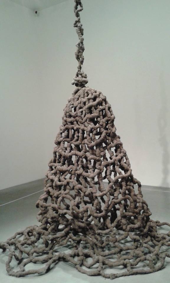
Posted: December 14, 2014 Filed under: Documentation, Subject, Third Year | Tags: body, casting, contemporary, documentation, female, female body, plaster, sculpture Leave a commentI haven’t posted anything about practical work this term which is awful to say the least!
I started with collaging architecture around Rome and incorporating my drawings into images of Rome, with the idea of surgery and beauty influencing me. I did find (and took me a while to decide) that the use and the idea of surgery in my work was difficult to use as there’s only so much to say on it (as with dissertation work too.)

I then started to look into Classical Italian sculpture which spurred on my view of the ‘ideal’ body. I made little female figures out of clay – initially hoping to incorporate the cosmetic surgery by smashing in the faces. The more I made, I looked into body shape and changing the proportions of the body for each little figure. At first I just went straight into clay but each one took longer to create so then I had a wire base and modelled clay over it. It worked better but it did mean the clay cracked where the ‘joints’ of the body are.


I have found this year very stressful and it does go exceptionally quick which causes worry for me. Especially as we are near the end of the first term and I have properly only got into the swing of my project.
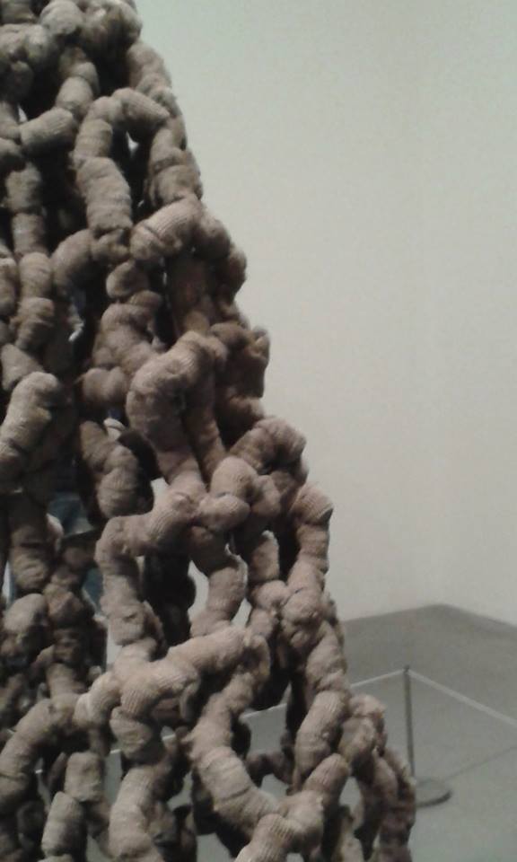
As I have been looking at the ‘idealistic’ body, I have gone back into what I was doing last year – casting body parts. I am hoping to create a Frankenstein ‘monster.’ One out of people’s favourite/most liked body parts and one out of least favourite body parts. So far I have two legs, a chest, shoulder and an arm. Obviously it is quite annoying to have to take time of someone else’s day to help me with my project but most people I have asked seem willing and interested in the outcome. I must admit that one of the legs I have isn’t a favourite limb of the person I cast but I think it would work well with the piece as it is different – only in a way that one leg is a lot longer than the other.
I do hope to sand areas down so that it is smooth and less alien like – but it really does depend on how the plaster works with the shape of the cast. In this piece I hope to display it in three parts: 1. the head, shoulders, chest and arms 2. the stomach 3. the hips, bum, legs and feet. The lower body will be sat down as that is the way I casted the legs. Hopefully by the next stage I can complete a standing person.
The photos below are from the ‘favourite’ body


Next week I have a ‘schedule’ for the least liked body – where most of the features are from the face which I am excited to do and create together.
I am also casting the stomach, bottom, and shoulder/arm for the body above the same day and hopefully at the end of the week I will be able to plaster it all!
I think they will be rather bizarre but that with each person’s favourite limb it will create an ‘ideal’ figure.
(This post was originally posted separately on 21/11/14)
On Friday I casted the upper body. Unfortunately there wasn’t enough plaster for me to use for all of it (I felt like I couldn’t use it as there were ceramicists and makers that also needed plaster for their own work) so I now know that I will buy my own plaster and cast it separately. Before pouring the plaster in the mould, you have to put in the release agent which is known as soft soap. The mould of my face was easy to do as I could see where it was going but for the body, it was much more difficult.


As the body is made up of different peoples body parts, I couldn’t see where the release agent was going and trying to squeeze my hand and arm down into someone else’s arm was weird and hard. Because of this, one of the hands looks as if half of it is missing (too much release agent so the plaster didn’t fully set) and the other I couldn’t get the mould off.

The mould of the upper body was more difficult to get off to release the plaster cast than I imagined.


Now knowing how difficult it is to complete a full size human plaster cast mould, with different people’s limbs and parts, I think I will make the parts separately and not join them together, and if I do decide whether to join them together, I will have to re-think about presentation. I would still like to finish the body I am doing as I am curious to see what it would look like and maybe present it as a relic.


(This post was originally posted separately on 14/12/14)
The Body (part 2) Is classical Art Inescapable?
Posted: October 14, 2014 Filed under: Contextualisation, Subject, Third Year | Tags: classical, contemporary, human form, lecture, sculpture Leave a commentJon Clarkson 14/10/14
The Body (part 2) Is Classical Art Inescapable?
Unfortunately I wasn’t able to make the first past of the lecture due to a dissertation tutorial last week, but I’m so glad that I went to today’s lecture as we were looking at and talking about the body, in particular ‘Loacoon,’ a classical sculpture from around c.200 BCE – 70CE, based in the Vatican Museum (where I have visited!) Michaelangelo drew from the ‘Laocoon,’ for the Sistine Chapel.

Vanessa Beecroft ‘VB35’ 1998

‘VB35’ is a performance piece. The piece represents the idea that women are seen as mannequins and that this ‘modelesque figure’ is the ‘ideal’ body type for women. The women cut out sexual pleasure, they allow to be present with the viewer. We spoke about how the nude bodies have become a ‘uniform,’stood out representing themselves as female figures. Similarly, ‘VB64’ 2009, show the figures as statuesque, in a very pale make up, making the bodies appear paler then they are.
Richard Deacon ‘Laocoon’ 1996

You can really see how Deacon has taken influence and inspiration from ‘Laocoon’ with the curved 3D forms taken from the snakes, fighting with the figures in the sculpture. I think that is a very good example of appropriation.
The classical features of ‘Laocoon’ and many other classical sculptures of figures are the approved anatomy, the figures are usually nude apart from an area covered by cloth which has been placed to accentuate the body, although most classical sculptures are fragmented with age. Another obvious feature, is that classical sculpture is made up from marble, due to the availability of materials in the past.
After looking at classical sculpture, I have noticed that the veins in contemporary sculpture aren’t very pronounced than they are in classical art. Although the art is real, it never seems as realistic as (contemporary) figurative sculptures as these aren’t so muscular and don’t show the ‘ideal fit muscular’ male body. Contemporary sculpture feels half hearted and it isn’t as dramatic as classical, in particular nudity is acceptable whereas now I feel it’s unseen unless it has is shown in art.
Marc Quinn ‘Peter Hull,’ ‘Alexandra Westmoquette’ 2000 (for both)


Both of these sculptures are based upon disabled people. Looking at classical sculpture that has been fragmented, it is very noticeable the differences of the bodies. In classical i.e. ‘female torso’ 1st Century CE, the limbs have been cut off specifically, whereas Quinn creates sculptures of disabled people without limbs. Some people find it difficult to look at disabled people but are fine with looking at sculptures where the limbs are no longer there, cut off without meaning. I feel that when people find it hard to view a sculpture similar to one’s above, they find it difficult to understand without the feeling of pity. I like that with Quinn’s work, it enables us to look at disabled people in a different way. The material that he uses is clean, fresh, more beautiful, more realistic to us.
Louise Bourgeois ‘Femme‘ 2005

This piece of sculpture was interesting to talk about because the question was whether it was based upon a disabled woman. The figure is designed to look as if it is about to fall, and her arms are keeping the balance, keeping the body to fall, disrupting itself from the hanging presence. The voluptuous shape was subtley and crudely modelled on areas of the work i.e. breasts and stomach. The stomach area seems to show a pregnancy. The legs however don’t seem too important, that they don’t need to be there, whereas the arms are the support.
Marc Quinn ‘Thomas Beatie,’ ‘Chelsea Charms’ 2010 (for both)

I really liked these pieces of work. Both real bodies, although they don’t look realistic. I think that Charms’s breasts have definitely been surgically created due to shape and form.
I found this lecture very interesting because of my interest in the human form, particularly the female form. I really liked Quinn’s work due to the material used and the subjects used too.
